Stagetimer 2.0 is here with improved design and audio chimes 📢 🎉
Stagetimer version 2.0 is here, and I love it!
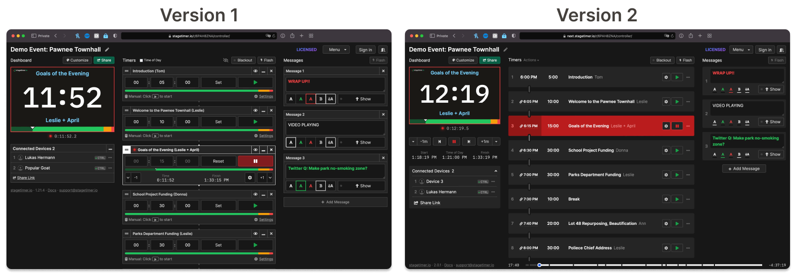
It’s a complete redesign of the most important page: the controller.
What makes it great? Why is it better than the previous version?
When I started working on this project, I was completely new to the AV industry. I had never worked in a live production before. I just saw a problem worth solving and I knew I had to do it.
So I did it. It had to be easy to use and easy to understand. And it had to be reliable.
But I had no idea how professionals like you would use it.
This forced me to listen to your feedback. We got hundreds of emails from you. How you used Stagetimer. What you liked and disliked. What was missing from it.
Version 2.0 takes all your feedback into account. I’m sure you will love it!
Don’t make me think

Yes, the new design makes you think less. The old design had a lot of visual clutter. Plenty of borders confused the eye. And the stuff was hard to find, it wasn’t aligned nicely.
I tried to remove as many borders, texts, and icons as possible. But all the functionality is still there. In fact, there’s more functionality now.
Every timer has now five essential elements:
- An index number
- The start time
- The duration
- The title and speaker (and notes)
- A start button (and other actions)
All these elements are nicely aligned. Just like in an Excel sheet. This makes information very easy to spot.
All additional texts, interactive elements, and options are either hidden in popups or visible when the mouse is over the element.
The start time is now always visible. You can define one or leave it empty. In any case, the start time has no influence on the timer, except with the “Schedule” trigger. But if you choose a start time on the first element, then all other start times are calculated automatically. This is very useful for live productions. It even shows you when you started the timer late so you see the delay and adjust for it.
Check out the controller documentation page for all the nitty-gritty details.
Duplicate timers
Yes, you can now clone individual timers. This has been requested a lot. So here it is 😄.
Bulk Actions
I wanted to save you some time. So I added a bulk action. You can now link or unlink all the timers at once, as well as hide the titles and speakers.
Transport controls

I stole this idea from video players 😅.
It makes a lot of sense to have control of all the timers in one place. It also allowed me to move some elements to keep the layout clean.
The transport controls include the tweak controls to add or subtract for a running timer. It also shows the start time, the current time of day, and the calculated finish time.
Chimes and flashes
Honestly, this was way easier to implement than I thought it would be. Play a chime when the timer is finished or gets into the yellow or red. Same with flashing the timer. You can even define a custom sound.
One caveat though: Some browsers block websites from playing sound without user interaction. So if you share the timer link the chimes may be muted and the person has to click on the unmute button.
Timer appearance

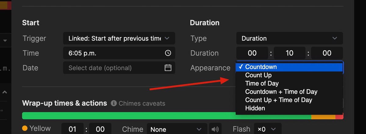
This is a small change but has a big effect. Previously, the appearance of the timer could only be changed for the entire room. Now you can change it for individual timers. So each timer can have a different appearance.
Really nice if I may say so myself 😄.
Event progress bar

If you used the agenda link before, then this progress bar is familiar to you. It runs across the bottom of the screen and gives a quick overview of where it’s at in the event.
Now the controller page has the same progress bar. Importantly it shows the progress of the event, not the individual timers. On the left, it says how much time has passed. On the right, it shows the estimated time left.
Just like when you’re watching a Netflix show!
Moderator link

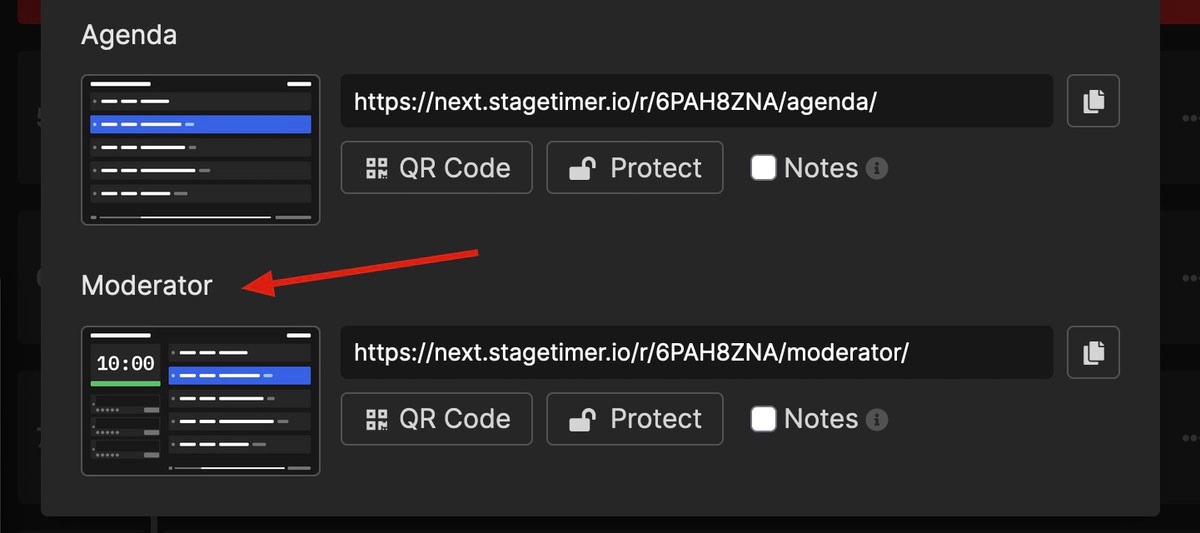
The agenda link is used to show a button when you moved the mouse. With this button, you could open the sidebar with the timer and messages. Now there’s a separate link for that: the moderator link.
Half of the moderator page is identical to the agenda page. The other half allows your staff to see the timer and send messages to the talent.
Plus, if you are using notes, you can choose to show the notes on the moderator page. Make sure to select the “Notes” checkbox before sharing the link.
That’s it for release 2.0. As always, feel free to contact us, especially if you find a glitch or have helpful feedback.
Check out the full list of changes on https://stagetimer.io/changelog/
Cheers,
Lukas
Get notified about new updates:
