Custom Outputs
With Output Links, you can create customizable outputs that display timers, messages, and other elements exactly how you need them. Each output has its own unique link that you can share with your team or audience.
This page covers how to customize these outputs - from arranging elements on a grid to configuring fonts, backgrounds, and visual styling. For information about creating outputs and managing links, see the Output Links Overview.
The Customizer Interface
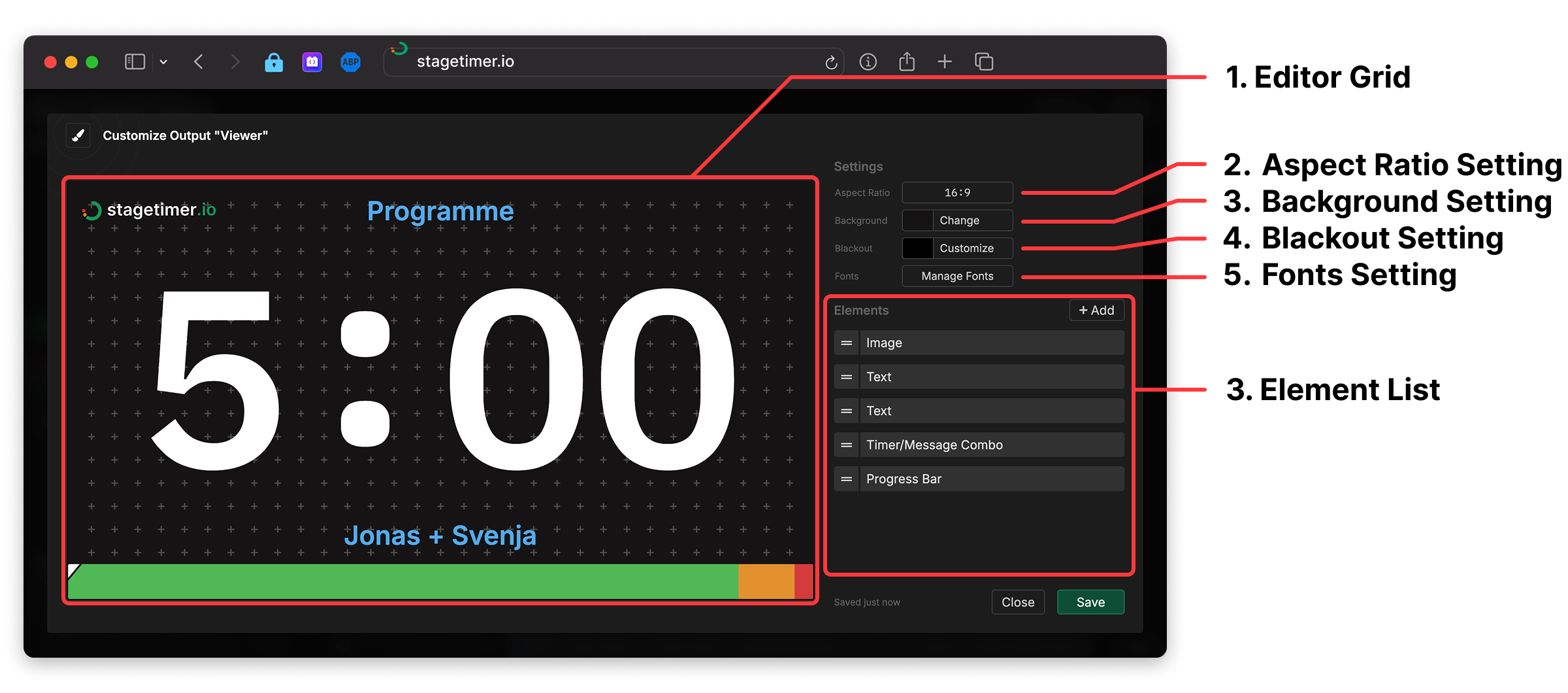
The output customizer is where you design the layout and appearance of your custom outputs. It provides a visual editor with drag-and-drop elements, styling options, and real-time preview.
Where to find the Customizer
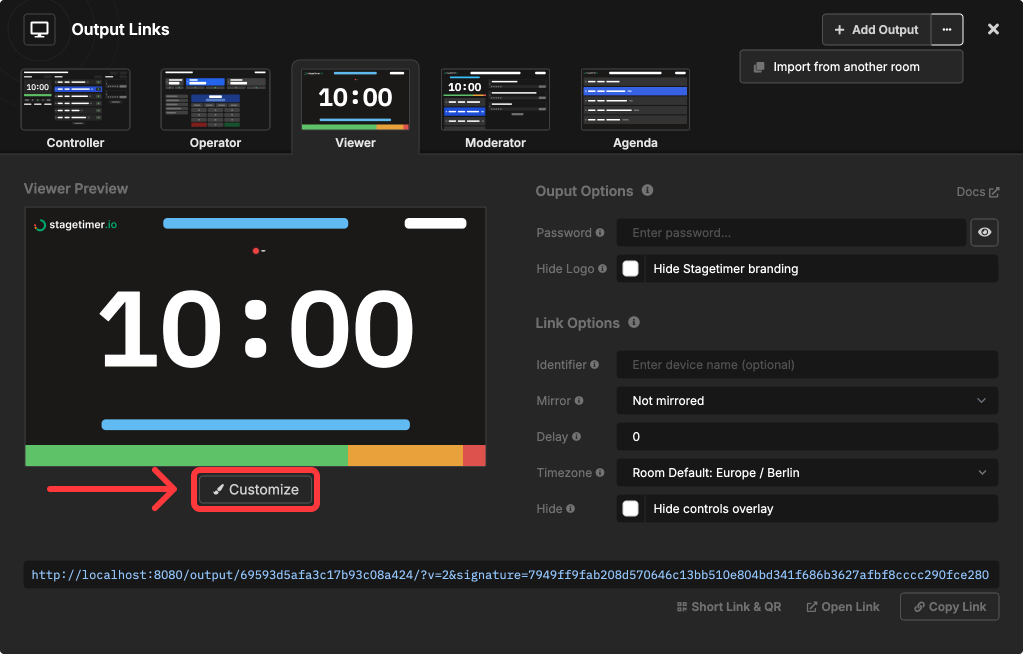
Open Output Links and select the output you want to customize. Click the “Customize” button in the preview section to open the customizer.
1. Editor Grid
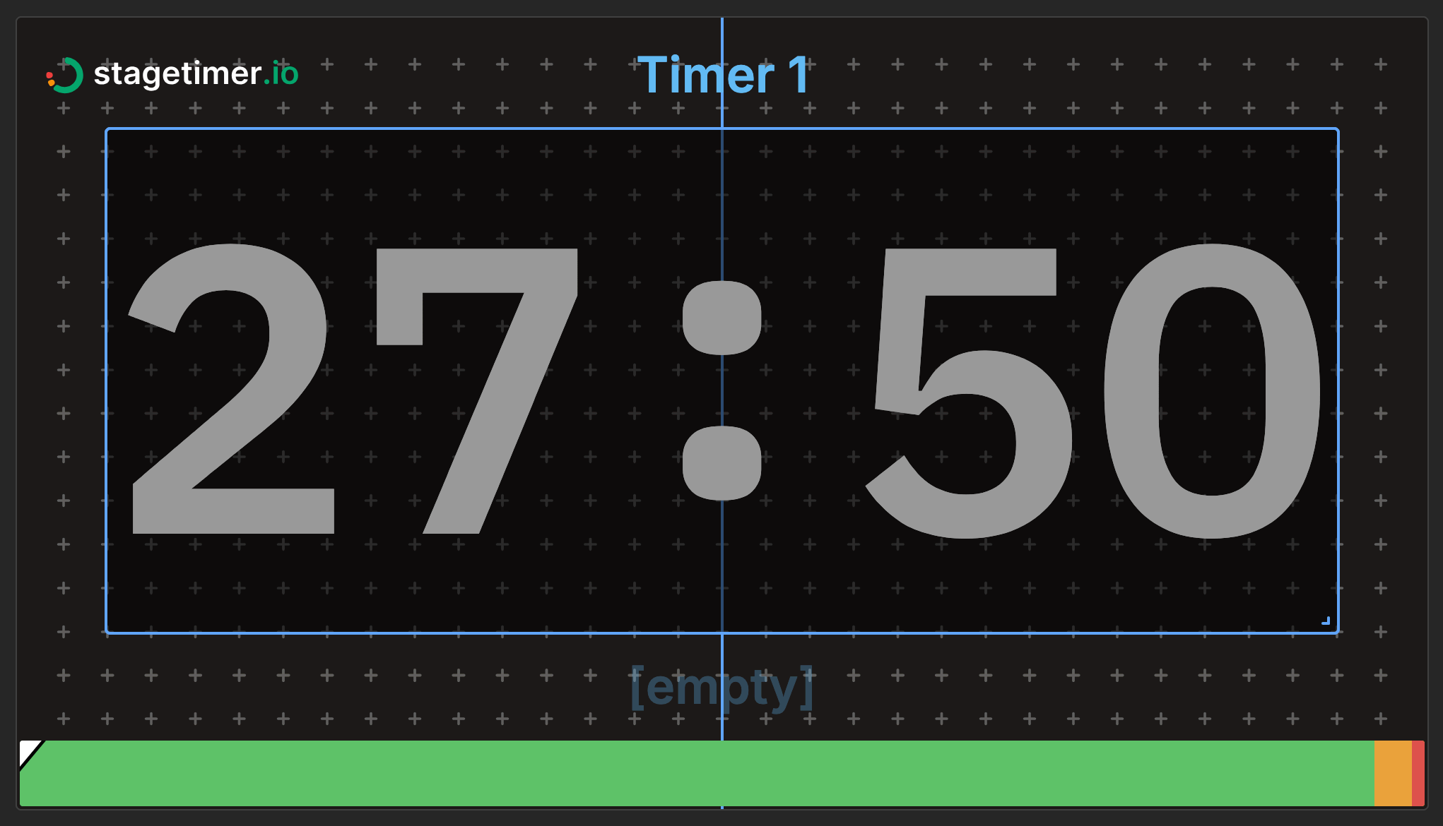
The editor grid is the main canvas where you arrange elements for your output. Click and drag elements to reposition them, use the corner and edge handles to resize, and press Delete to remove selected elements. Elements can overlap and be layered - use the element list to control the stacking order.
The grid includes helpful features like center guide lines that appear when moving elements for alignment, snap-to-grid for precise positioning, and real-time preview of your changes. The grid respects the aspect ratio you’ve configured in Output Settings, ensuring your layout looks correct when displayed.
2. Aspect Ratio Setting
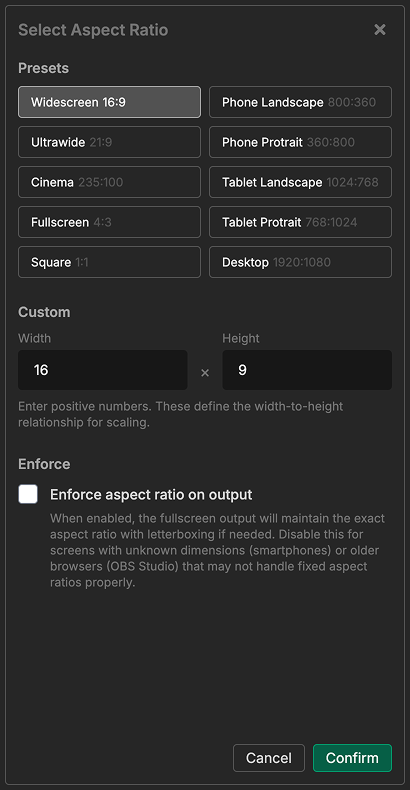
Choose the display aspect ratio for your output. The aspect ratio determines the shape of the editor grid and how your output displays on screens.
Select from common presets like Widescreen (16:9), Ultrawide (21:9), Square (1:1), or device-specific ratios for phones and tablets in both landscape and portrait orientations. You can also enter custom values for specialized displays like super-ultrawide monitors (32:9).
By default, outputs maintain their exact aspect ratio with letterboxing on screens that don’t match. You can disable this enforcement for screens with varying dimensions (like smartphones) or older systems like OBS Studio that may not handle fixed aspect ratios properly.
3. Background Setting
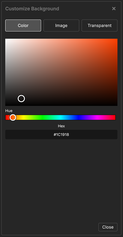
Set the background for your output using a solid color, an uploaded image, or enable transparency for use in OBS and video overlays.
When using a background image, you can choose whether it should cover the entire output (may crop) or contain the full image (may show background color on sides).
4. Blackout Setting
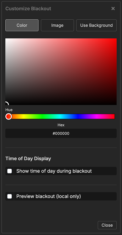
Customize what appears when the blackout button is engaged. You can show a custom color, upload an image, display the time of day, or use the same background as your output.
The “Use Background” option is particularly useful for transparent overlays in OBS - it keeps the transparency intact while hiding all timer elements and preserving the video signal underneath. Blackout settings update in real-time across all connected outputs.
5. Fonts Setting
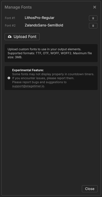
Upload custom fonts (TTF, OTF, WOFF, or WOFF2) to use your brand typography across all text elements including timers, messages, and text labels. Once uploaded, custom fonts appear at the top of font selectors throughout the output customizer.
6. Element List
The element list shows all available elements you can add to your output, organized by category.
Timer & Time:
- Timer Element - Display countdown, count-up, or time of day
- Time of Day Element - Show current time with timezone support
- Timer Message Combo Element - Combined timer and message with automatic layout
Messages & Text:
- Message Element - Display messages from your controller
- Text Element - Static or dynamic text labels with placeholders
Progress & Status Indicators:
- Progress Bar Element - Horizontal bar showing timer progress
- Progress Ring Element - Circular ring showing timer progress
- On Air Element - Visual indicator showing when a timer is running
Interactive Elements:
- Transport Control Element - Embed timer controls with play/pause buttons
- Agenda Element - Display complete rundown with automatic highlighting
- Moderator Element - Message management controls for moderators
Media & Content:
- Image Element - Display logos, graphics, and images
- Iframe Element - Embed websites and web content
- QR Code Element - Scannable code linking to any URL
Click any element name to read its detailed documentation including all settings and customization options.