Agenda Element
What is the Agenda Element?
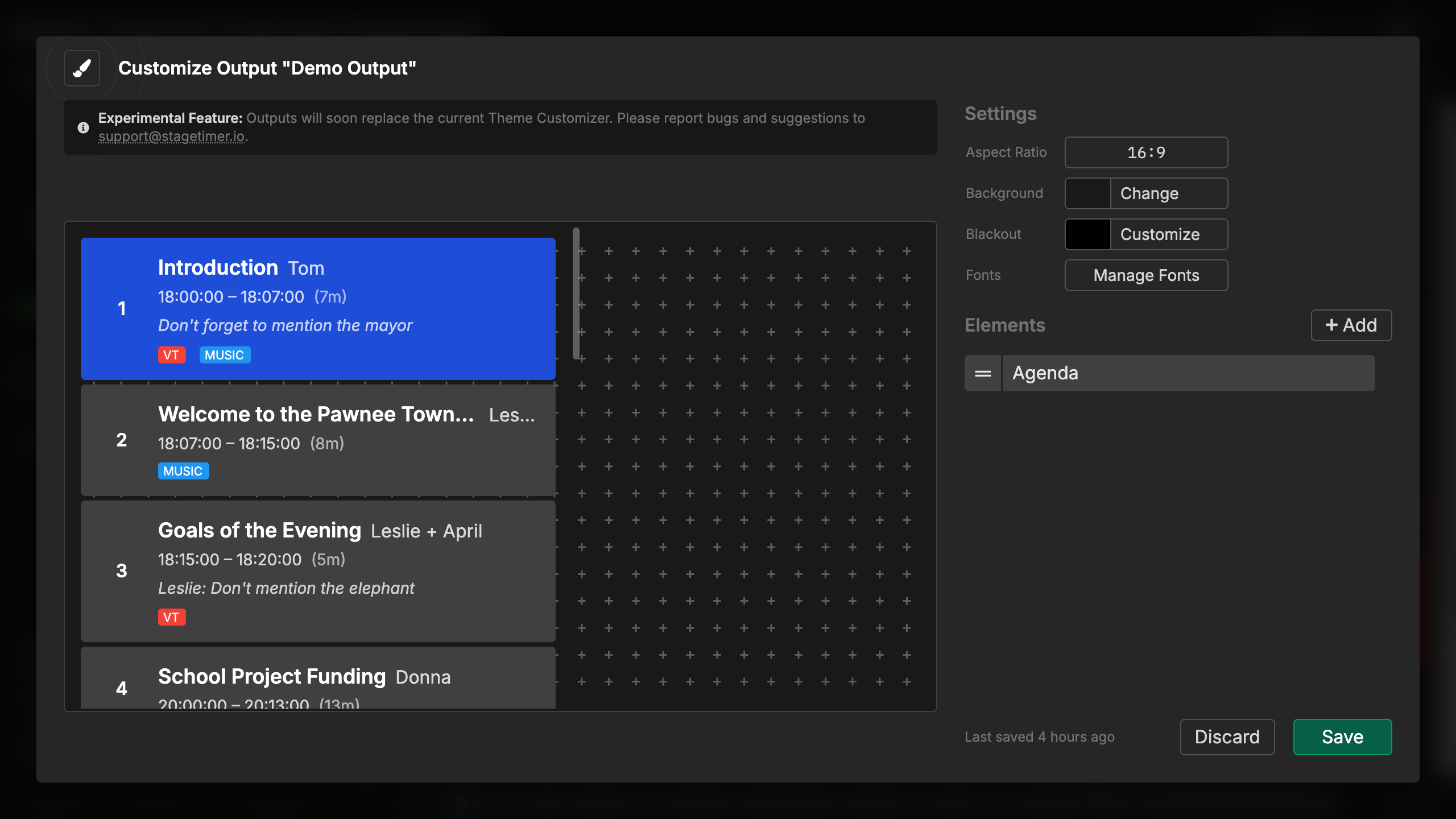
The Agenda element displays your complete rundown as a scrollable list, showing all your timers with their details. It automatically highlights the currently active timer and can show progress bars, start/end times, notes, and labels for each item.
This element is perfect for stage displays, confidence monitors, or any situation where speakers and crew need to see the full schedule and track progress through the event.
How It Works
The agenda element automatically displays your rundown:
- Lists all timers from your rundown in order
- Highlights the active timer with a distinct color
- Shows progress on the active timer with an animated bar
- Auto-scrolls to keep the active timer visible (optional)
- Updates automatically as you advance through timers
The agenda requires no manual control - it stays synchronized with your Controller, updating whenever you start timers, advance to the next item, or make changes to your rundown.
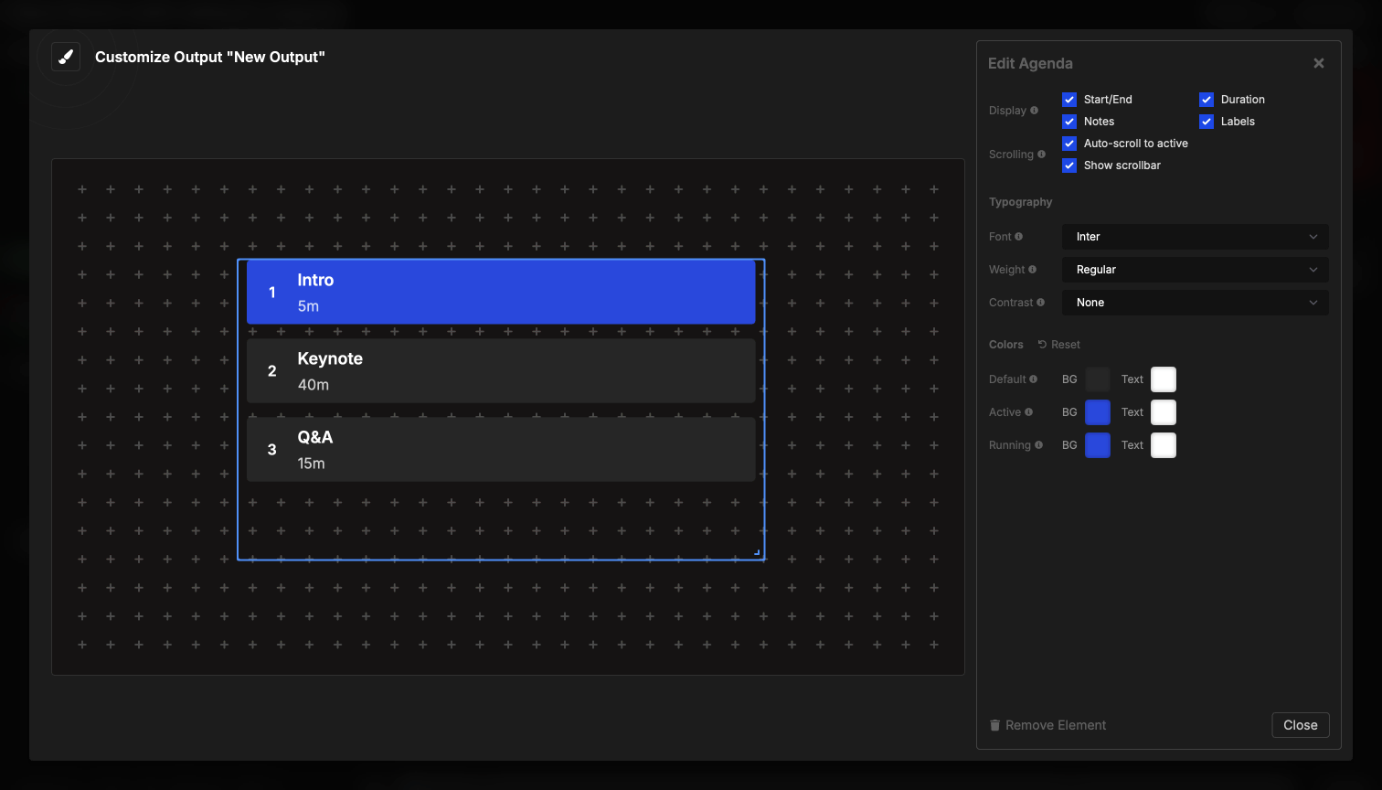
Element Settings
Display Options
You can configure what information appears for each timer in the agenda:
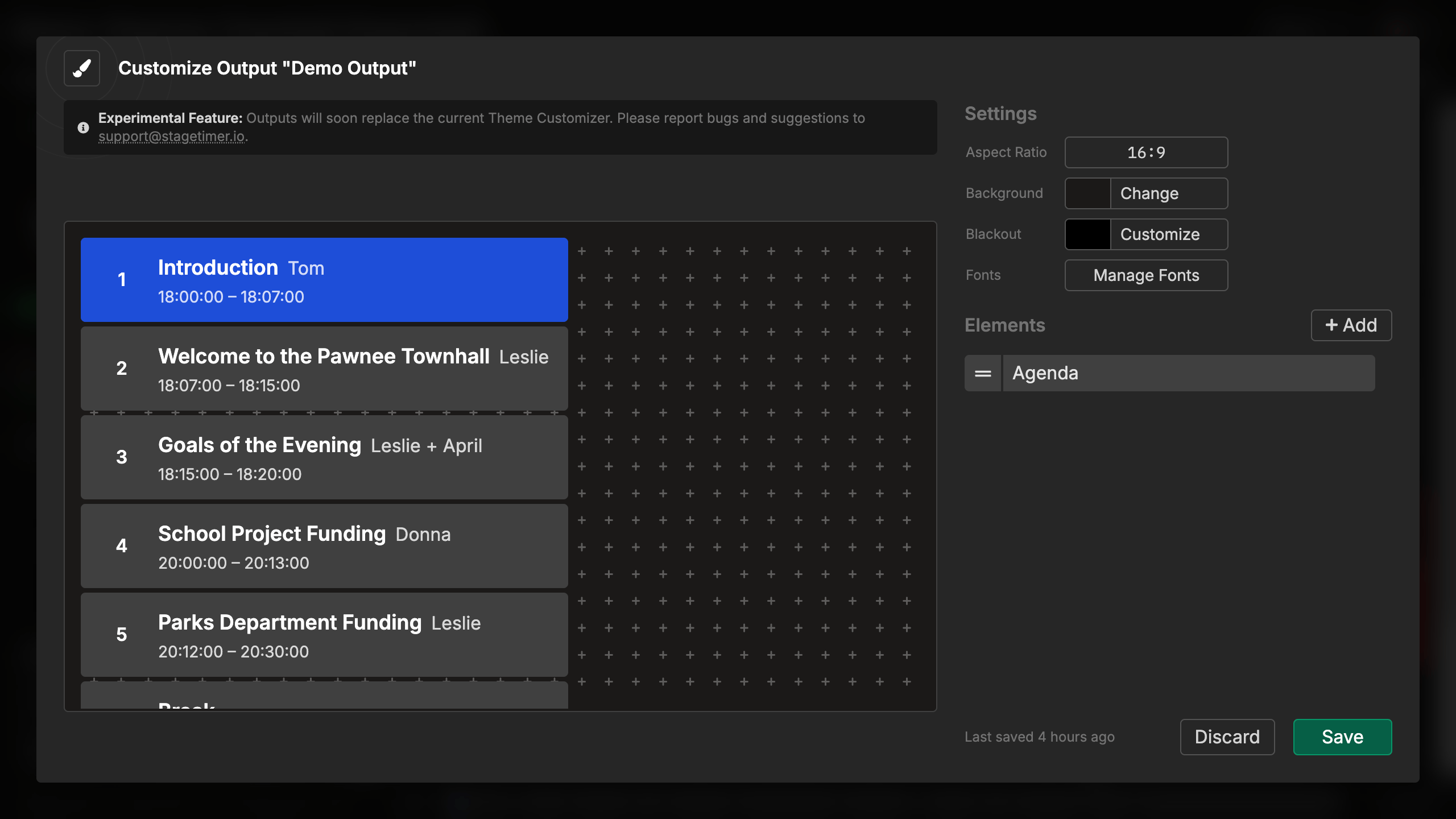
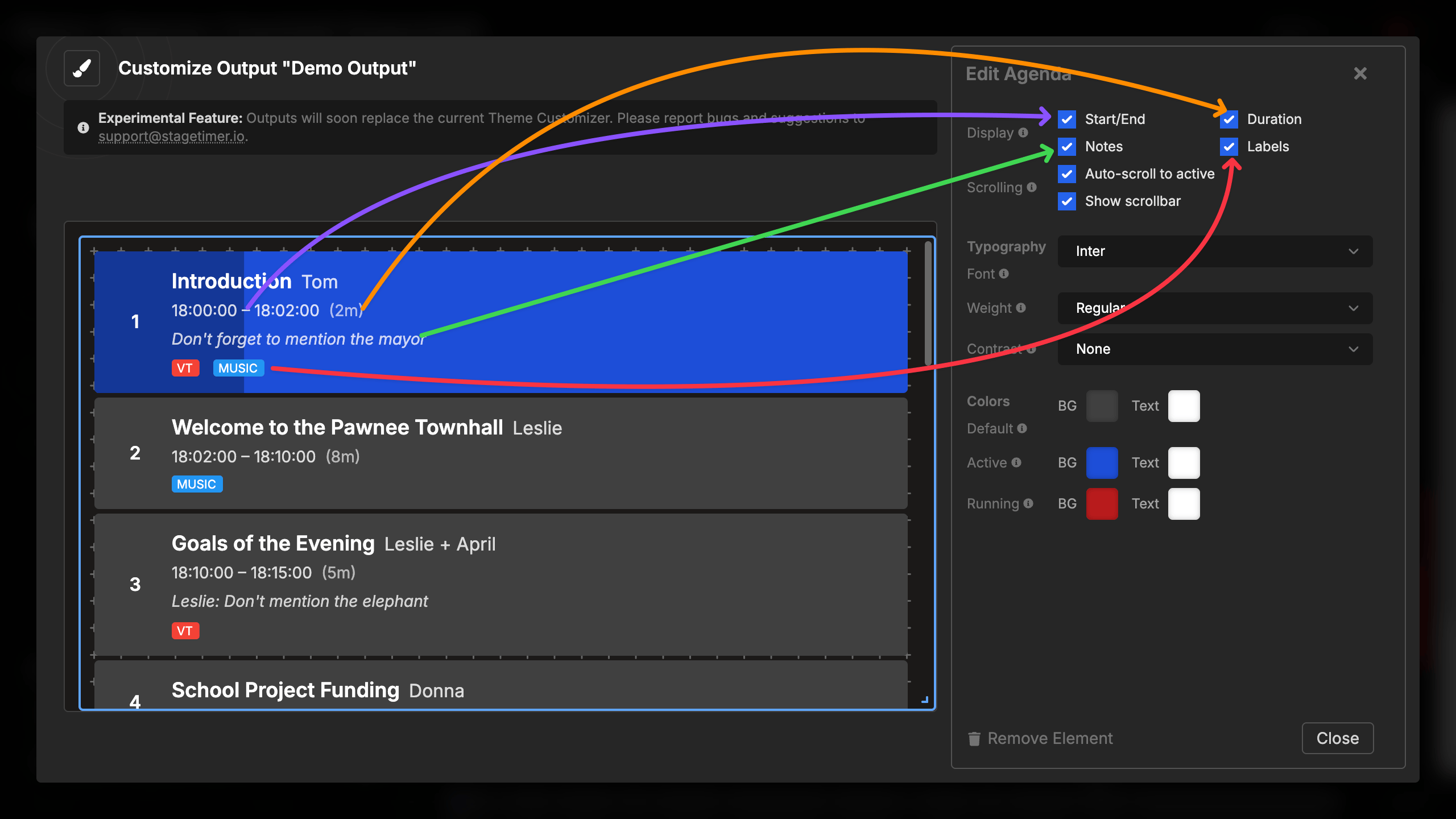
Start/End times:
- Shows scheduled start time and end time
- Formatted according to your room’s time format
- Helpful for keeping events on schedule
Duration:
- Shows the length of each timer
- Displayed in parentheses after start/end times
- Formatted as hours and minutes (e.g., “1h 30m” or “45m”)
- Helps understand the pacing of your event
Notes:
- Displays any notes you’ve added to timers
- Appears below the timer name in italics
- Supports multiple lines
- Perfect for instructions or additional context
Labels:
- Shows any labels/tags assigned to timers
- Appears as colored badges below timer information
- Helps categorize and identify timer types
- Useful for filtering or organizing content visually
Each display option can be toggled independently, allowing you to show exactly the information your audience needs. The element automatically adjusts spacing and layout based on what’s displayed.
Scrolling Behavior
The agenda element includes two scrolling settings:
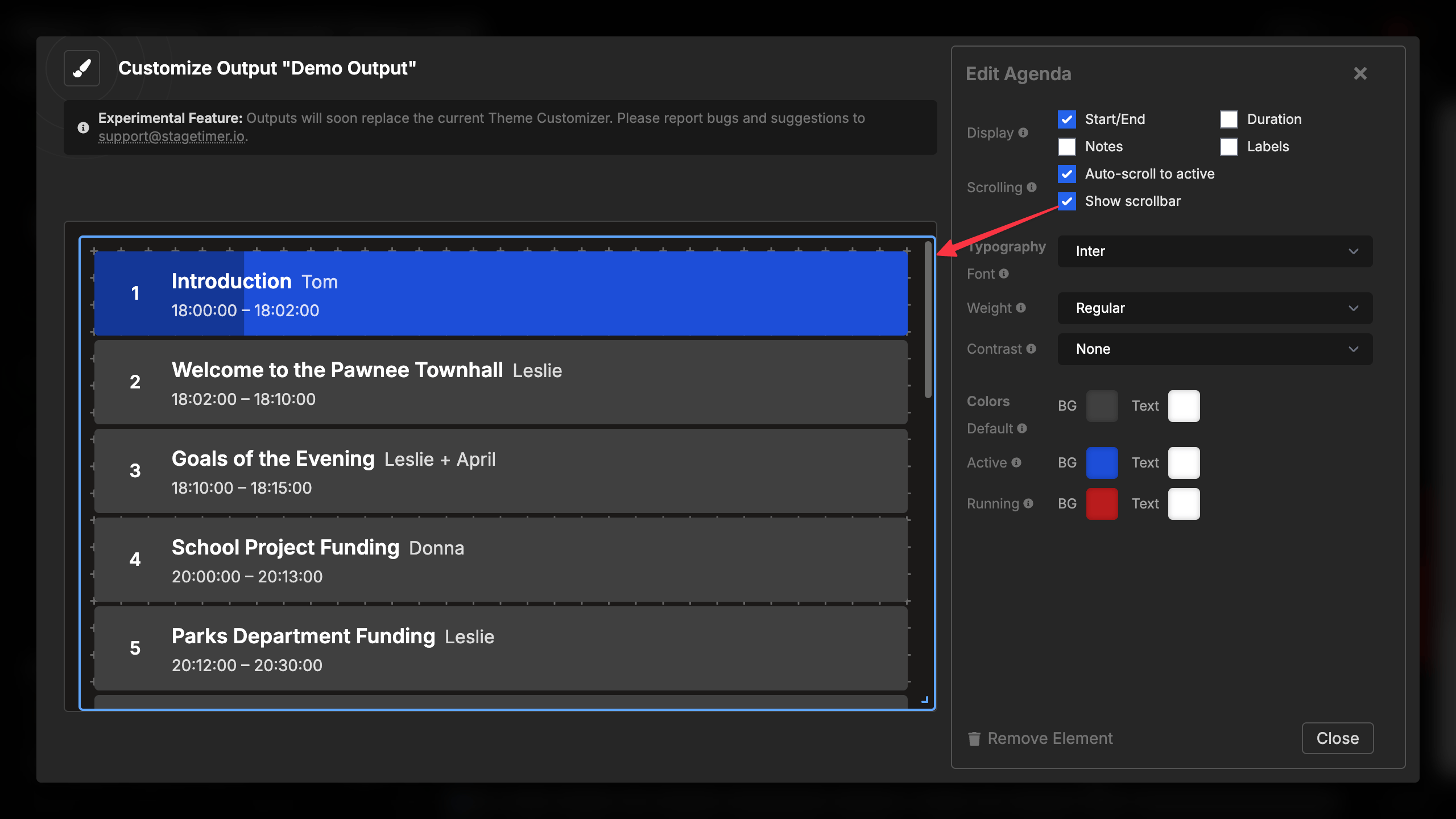
Show scrollbar:
- Choose to show or hide the scrollbar
- Hidden scrollbar creates cleaner appearance
- Visible scrollbar helps indicate when more content exists, making it possible for users of this output to scroll themselves
- Hidden scrollbar prevents users from scrolling themselves
Auto-scroll to active:
- Automatically scrolls to keep the active timer visible
- Centers the active timer in the viewport
- Smooth, animated scrolling
- If disabled and no scrollbar is shown, active timer might run out of viewport
Typography
Customize the appearance of text in the agenda:
Font selection:
- Choose from built-in fonts (Inter is default)
- Upload custom fonts
- Affects all text in the agenda
Font weight:
- Light, Regular (default), Medium, Semibold, Bold
- Applies to all text except timer names (which are always bold)
Text contrast:
- None, Shadow, Outline, or Background
- Improves readability over backgrounds
- Applies to all text uniformly
The element automatically adjusts font sizes based on the height of the container, ensuring optimal readability at any size. Smaller containers show compact text, while larger displays show more generous spacing and larger fonts.
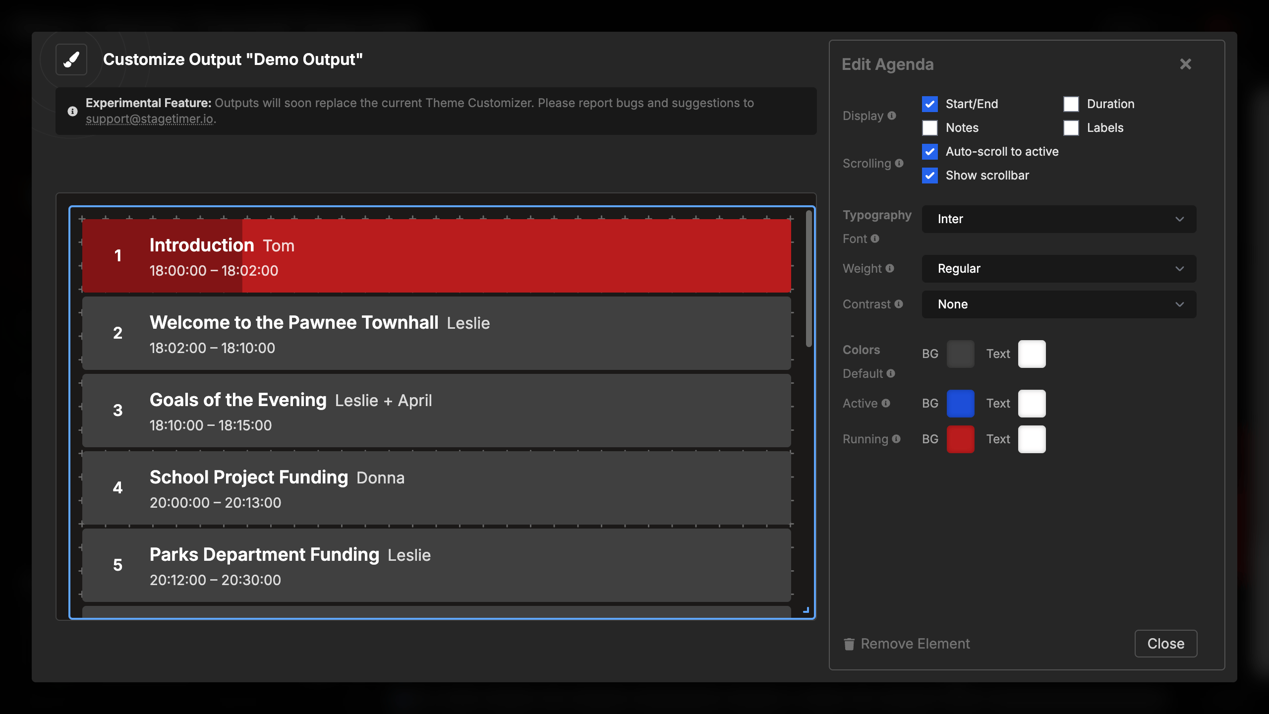
Color Configuration
The agenda uses three color states, each with background and text colors:
Default items (non-active timers):
- Background color (default: dark gray)
- Text color (default: light gray)
- Used for all timers except the active one
Active item (highlighted, not running):
- Background color (default: blue)
- Text color (default: light blue)
- Shows which timer is selected but not currently running
Active and running item:
- Background color (default: darker blue)
- Text color (default: white)
- Displays when the timer is actively counting down
- Includes animated progress bar overlay
Each color pair (background and text) can be customized independently, giving you complete control over the visual design. The progress bar automatically darkens the active color to create contrast.