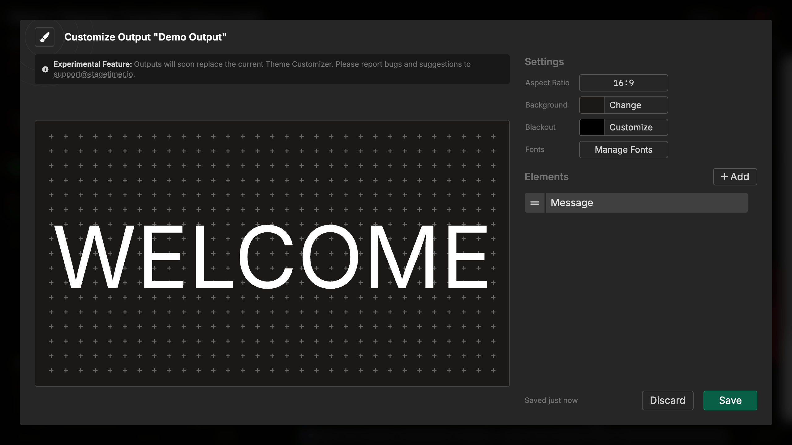
Message Element
What is the Message Element?
The Message element displays messages that you create and control from your Controller or Moderator interface. When you show a message, it appears in this element across all connected outputs, providing a way to communicate with your audience or stage talent.
The message element automatically resizes to fill the available space, scaling the text to be as large as possible while fitting within the element’s boundaries. You can display one message at a time, and messages stay visible until you manually hide them.
How It Works

The message element connects directly to your room’s message system. When you add a message element to your output:
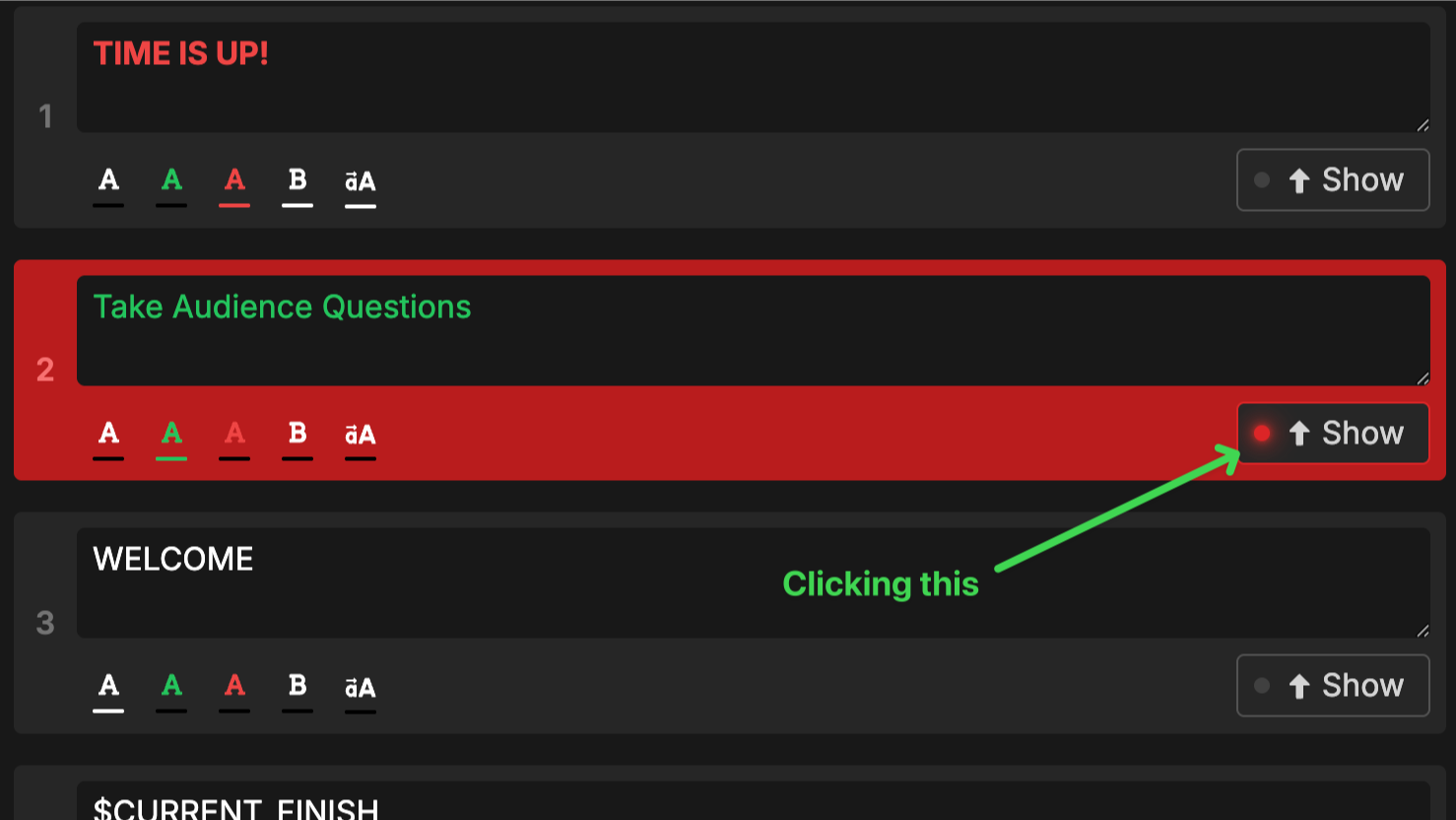
- Create messages from the Controller or Moderator page
- Show a message by clicking its Show button
- The message appears in all message elements across your outputs
- Hide the message by clicking Show again (it toggles)
The element remains empty when no message is active. You can configure multiple message elements with different styling if you want messages to appear in multiple locations with different appearances.
Message features from the Controller:
- Create unlimited messages (Pro and Premium users)
- Format messages with bold, uppercase, colors (white, green, red)
- Flash messages to grab attention
- Use placeholders like
$NEXT_TITLEfor dynamic content - Focus mode to display message fullscreen
Element Settings
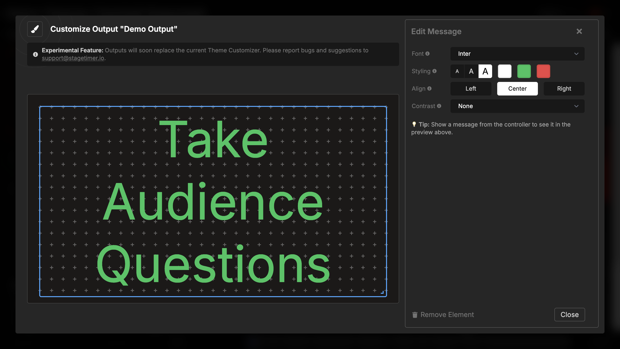
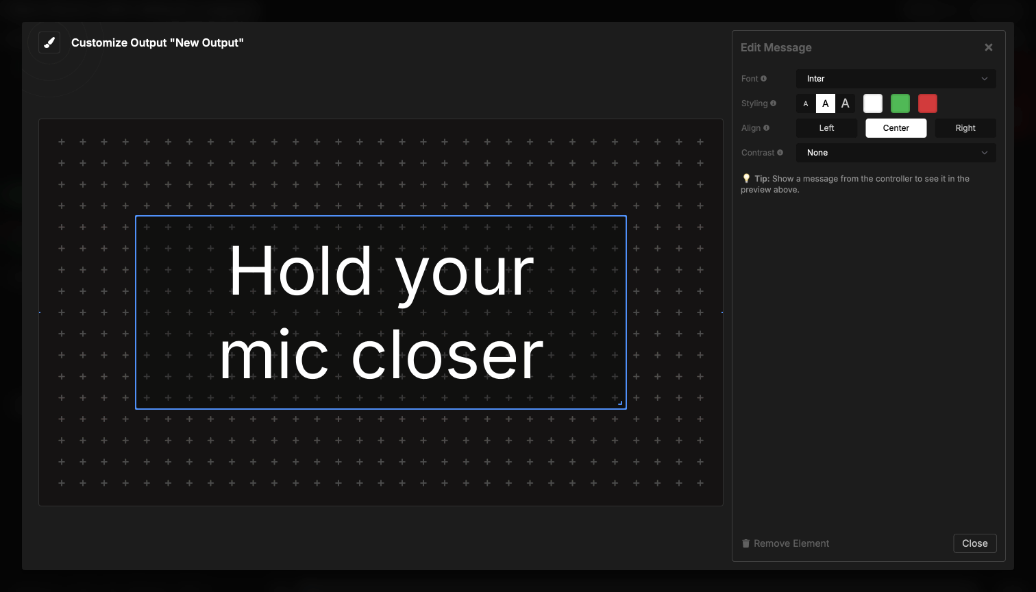
Font Selection
You can choose the font family for message display:
- Built-in fonts: Inter, IBM Plex Mono, Open Sans, Poppins, and many more
- Custom fonts: Upload your own fonts for brand-specific displays
- Fonts automatically load when the message appears
The default font is Inter, which provides clean readability for most message content.
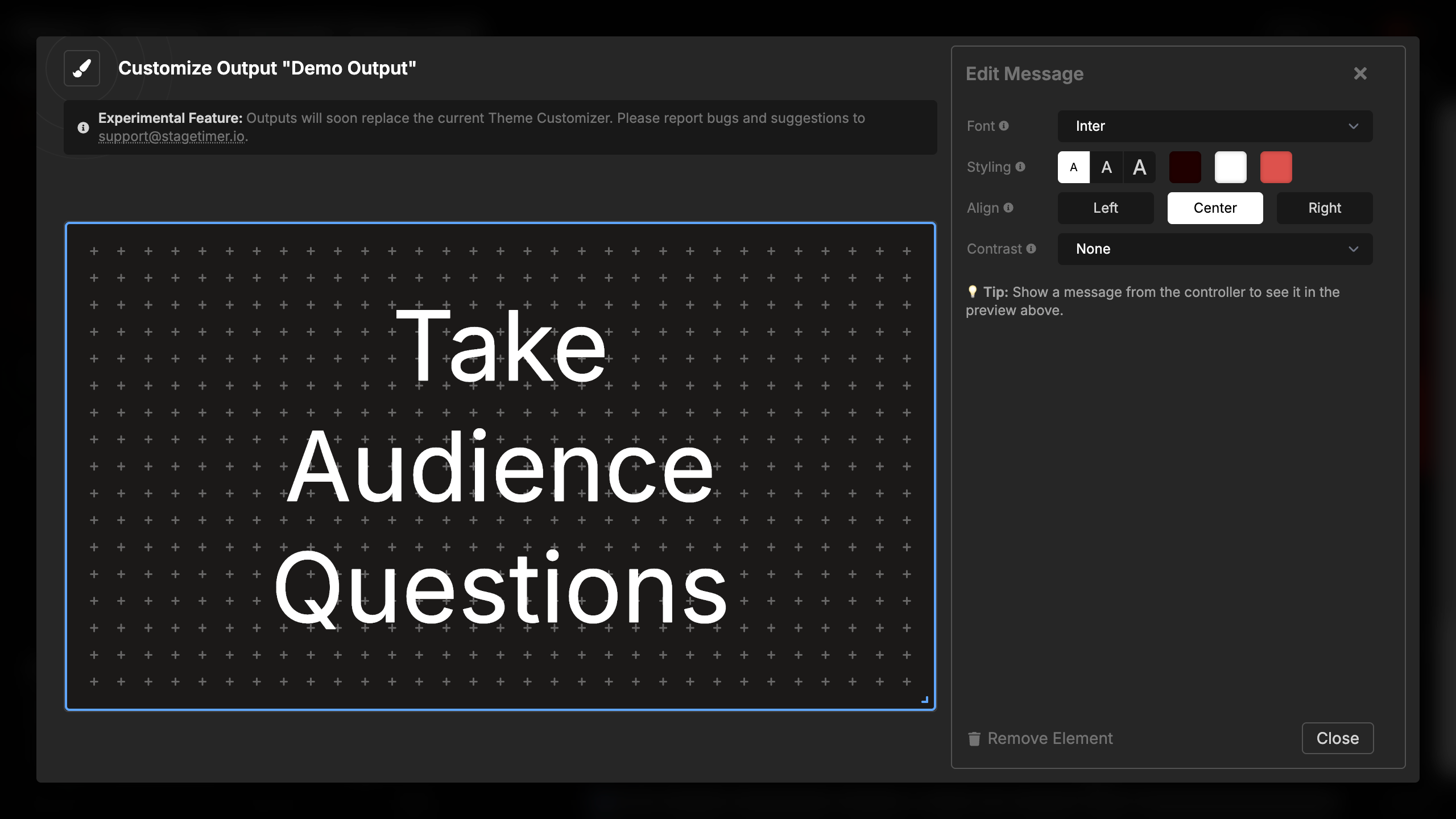
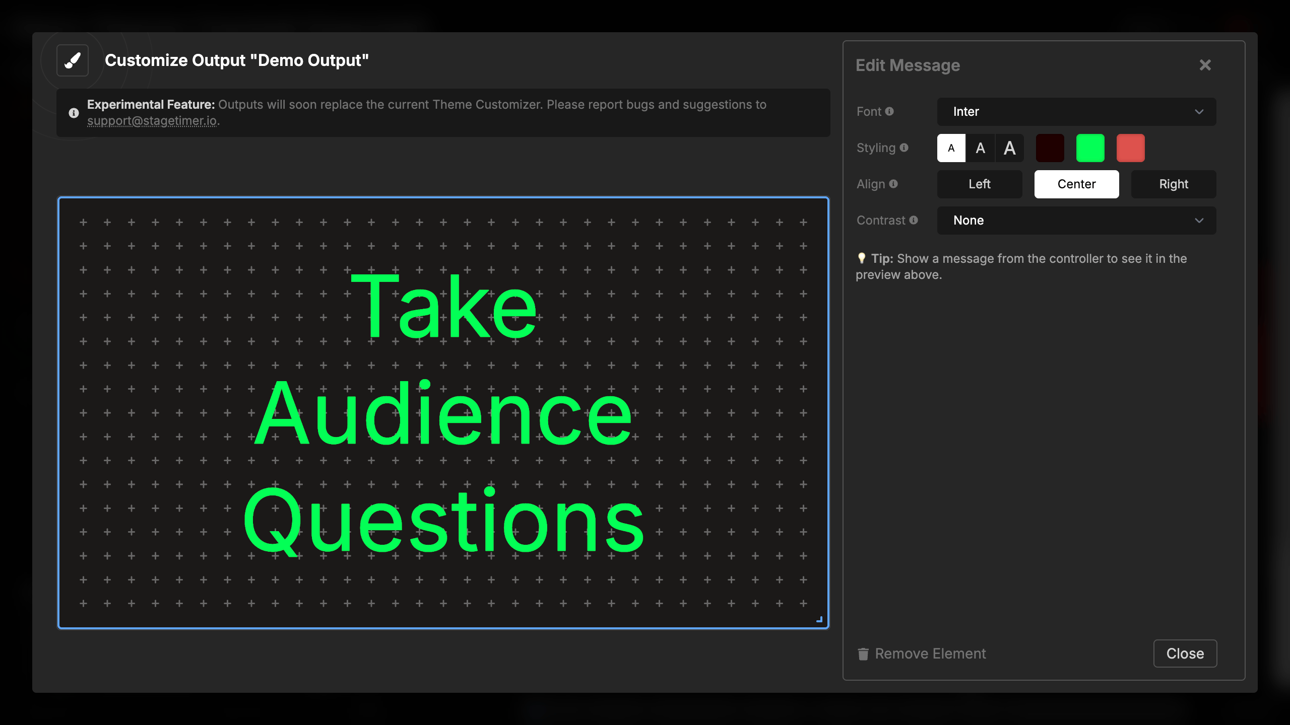
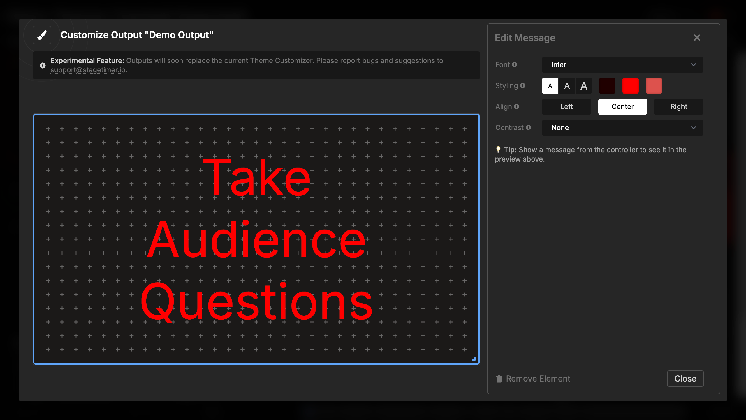
Styling and Colors
The message element uses the color settings from the message itself (white, green, or red), but you can customize what those colors look like in your output:
Font size:
- Small (76%) - Leaves more breathing room
- Medium (88%) - Balanced size
- Large (100%) - Fills the maximum available space
Color customization: Configure the three available message colors:
- White - Default message color (default: #fff)
- Green - Success or confirmation messages (default: #5ec269)
- Red - Alert or warning messages (default: #dd524c)
When you change a message’s color in the Controller, it will display using the color you’ve configured here. The message’s bold and uppercase settings are controlled from the Controller, not from the element settings.
Text Alignment
Set the horizontal alignment of message text on screen:
- Left - Text aligns to the left side
- Center - Text centers horizontally (default)
- Right - Text aligns to the right side
Multi-line messages wrap and align according to this setting.
Text Contrast
Add visual effects to improve message readability against backgrounds:
- None - No additional effects
- Shadow - Drop shadow behind the text
- Outline - Stroke outline around characters
- Background - Semi-transparent background behind text
These effects are particularly useful when displaying messages over video backgrounds or imagery where plain text might be difficult to read.
Message Control
Unlike some elements that pull data automatically, the message element displays only what you actively show from the Controller or Moderator page. This gives you complete control over when messages appear and disappear.
To preview message settings:
- Create and show a message from the Controller
- The message appears in your output’s message element
- Adjust settings to see changes in real-time
- Hide the message when done
💡 Tip: Show a message from the controller to see it in the preview above when configuring message element settings.
Using with Other Elements
You can combine message elements with other elements in your output:
Common combinations:
- Message + Timer: Use the Timer Message Combo element for automatic layout
- Message + Image: Display branding alongside messages
- Message + Text: Show static labels with dynamic messages
- Multiple Message Elements: Display the same message in different locations with different styling
Each message element in an output shows the same message content but can have independent styling settings.