Moderator Element
What is the Moderator Element?
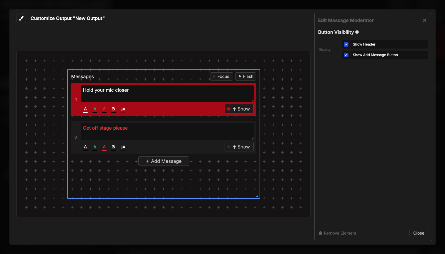
The Moderator element embeds message management controls directly into your output, providing a simplified interface for creating, editing, and displaying messages without accessing the full Controller page. It’s designed for moderators, assistants, or support staff who need message control but don’t need access to timer functions.
This element shows the complete message interface including all message cards, the Focus button, Flash button, and the ability to add new messages - essentially the Messages section from the Controller embedded in your output.
How It Works
The moderator element provides interactive message control:
- Displays all existing messages as cards
- Users can edit message content directly
- Show/hide messages with a single click
- Create new messages with the Add Message button
- Use Focus mode to display messages fullscreen
- Flash messages to grab attention
- Changes sync across all live connections
Unlike most output elements that only display information, the moderator element allows direct interaction. It’s essentially the Messages section of the Controller interface embedded in your output, perfect for giving message control to team members without full Controller access.
Available Controls
Message Management
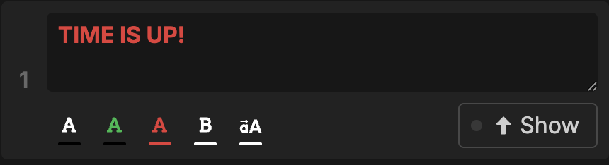
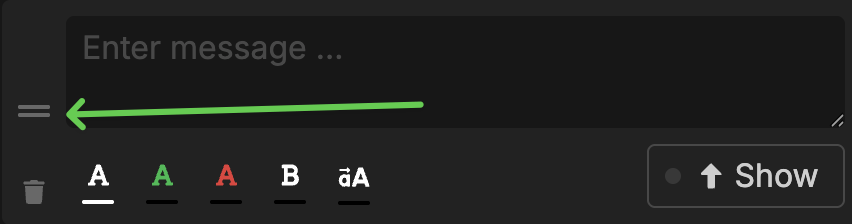
Message cards: Each message appears as a card showing:
- Message number (1, 2, 3, etc.)
- Message text content
- Color indicator (white, green, or red)
- Edit controls (text, color, bold, uppercase)
- Delete button
- Show/Hide toggle button
- Drag handle for reordering
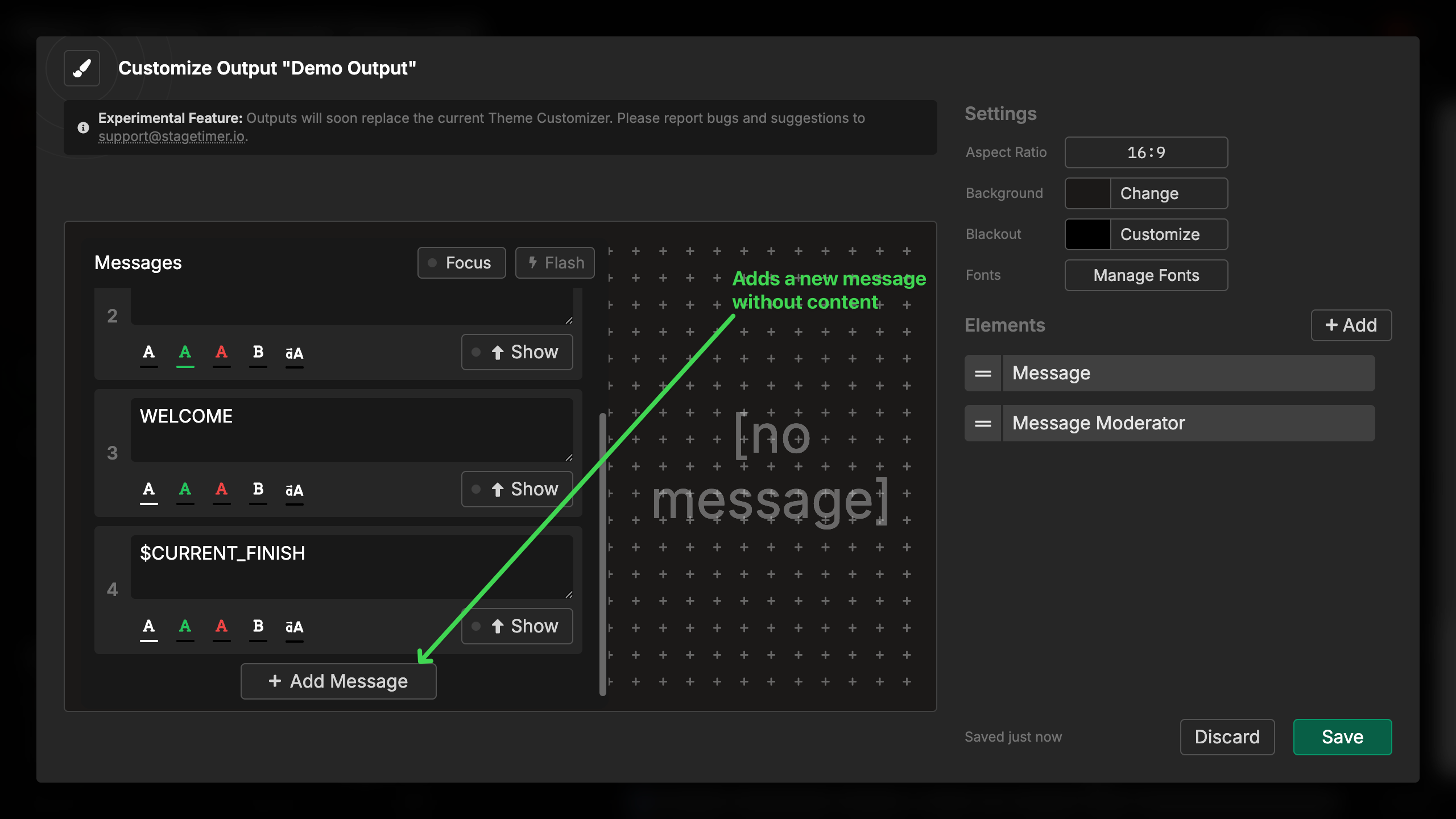
Creating messages:
- Click “Add Message” button at bottom
- New message card appears
- Enter your message text
- Configure color, bold, and uppercase
- Message is immediately available to show
Editing messages:
- Click any message card to expand controls
- Edit text directly in the text field
- Change color (white, green, red)
- Toggle bold formatting
- Toggle uppercase transformation
- Changes save automatically
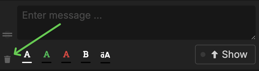
Deleting messages:
- Hover over a message card
- Click delete button on message card bottom left
- Message is removed from all devices
- Cannot be undone
- Currently shown message can still be deleted
Reordering messages:
- Hover over message card, handle is shown
- Drag messages by the handle icon
- Changes order in list
- Useful for organizing messages by importance
- New order syncs to all devices
Message Display Controls
Show/Hide button:
- Large button on each message card
- Shows green when message is active
- Toggles message visibility
- Only one message can be shown at a time
- Showing a new message hides the current one
Focus button:
- Header button (compress/expand icon)
- Hides all other output elements
- Displays message fullscreen
- Toggle on/off
- Useful for critical announcements
Flash button:
- Header button (lightning bolt icon)
- Makes current message flash 3 times
- Grabs attention without changing content
- Only works when a message is shown
- Button glows when flashing
Message limits: The element respects your room’s message limits:
- Free users: 3 messages maximum
- Pro/Premium: Unlimited messages
- Disabled messages appear grayed out but remain visible
- Upgrade prompt appears when limit is reached
Element Settings
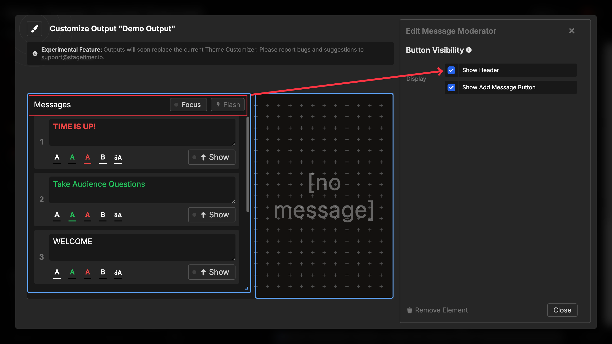
The moderator element has minimal customization options to maintain consistency with the Controller:
Display options:
- Show Header - Show/hide the Focus and Flash buttons section
- Show Add Message Button - Show/hide the ability to create new messages
When to hide header:
- When you don’t want moderators using Focus mode
- For cleaner, more compact interface
- When Flash button isn’t needed
- In space-constrained layouts
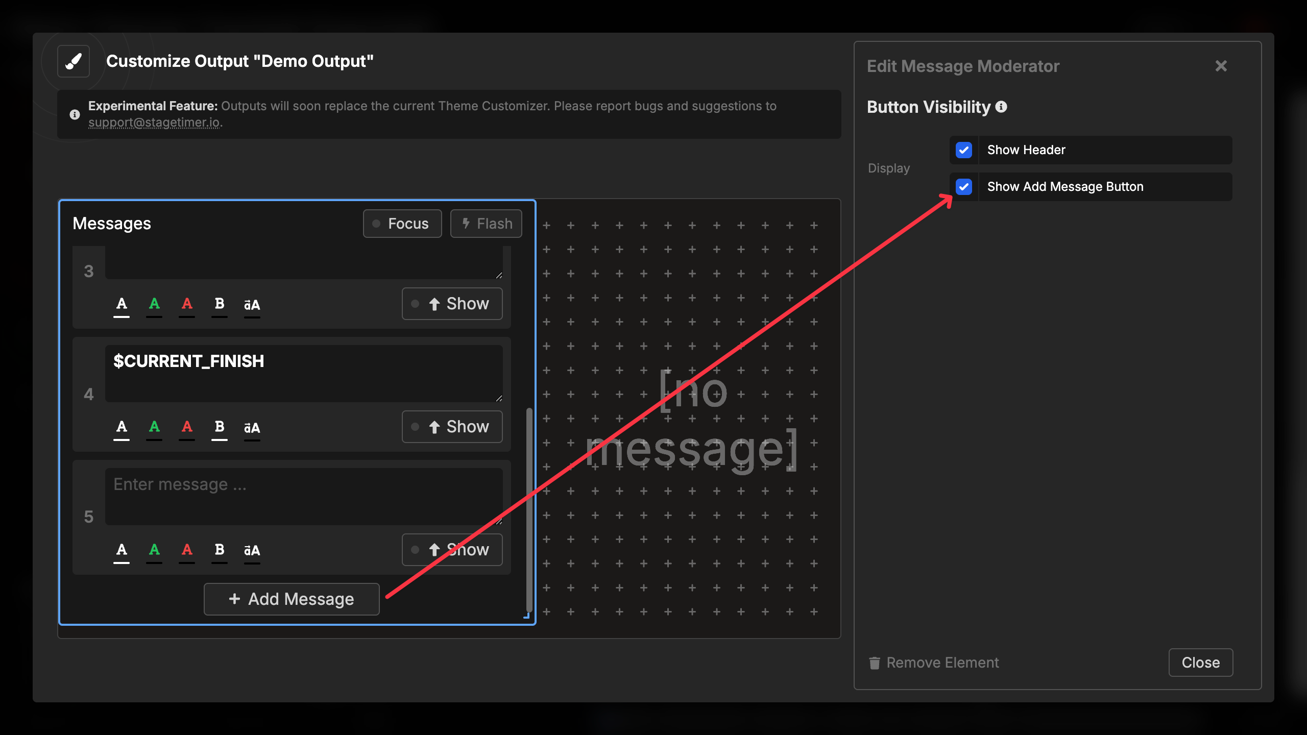
When to hide Add Message button:
- When all messages are pre-created
- To prevent moderators from adding messages
- For locked-down message sets
- During live shows when message list is finalized
The visual appearance (colors, fonts, spacing) matches the Controller interface and cannot be customized independently.