Progress Bar Element
What is the Progress Bar Element?
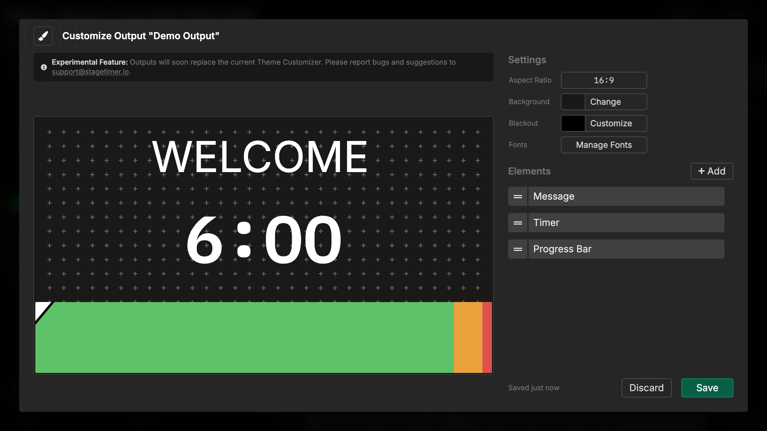
The Progress Bar element provides a visual representation of timer progress as a horizontal bar that fills from left to right as time elapses. It displays your timer’s wrap-up warning zones in different colors, making it easy to see at a glance how much time remains.
The progress bar is ideal for situations where you want a subtle, space-efficient time indicator that doesn’t require reading numbers. It’s particularly effective when combined with other elements or as a background progress indicator.
How It Works
The progress bar automatically tracks the currently active timer:
- When a timer starts, the bar begins filling from left to right
- Colors change based on wrap-up warning zones (green, yellow, red)
- Playhead indicator shows the exact current position
- Bar fills completely when the timer reaches zero
The progress bar updates smoothly in real-time, providing constant visual feedback about time remaining. You don’t need to control it - it automatically follows your active timer.
Visual layout:
- Bar fills from left to right
- Background shows all three color zones at low opacity
- Foreground shows progress with full color saturation
- Playhead marks the current position
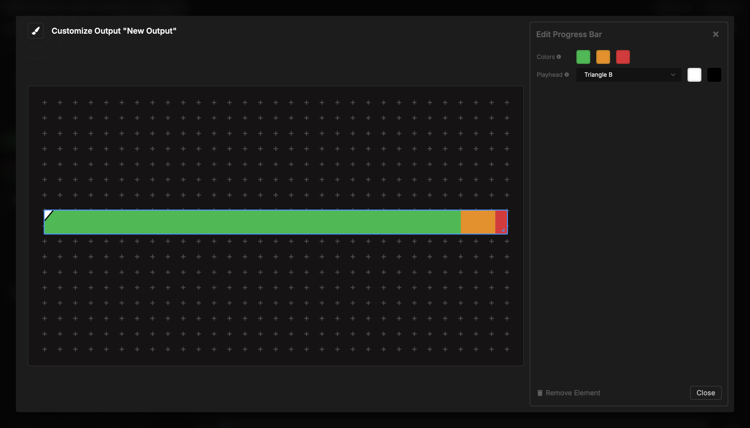
Element Settings
Color Configuration
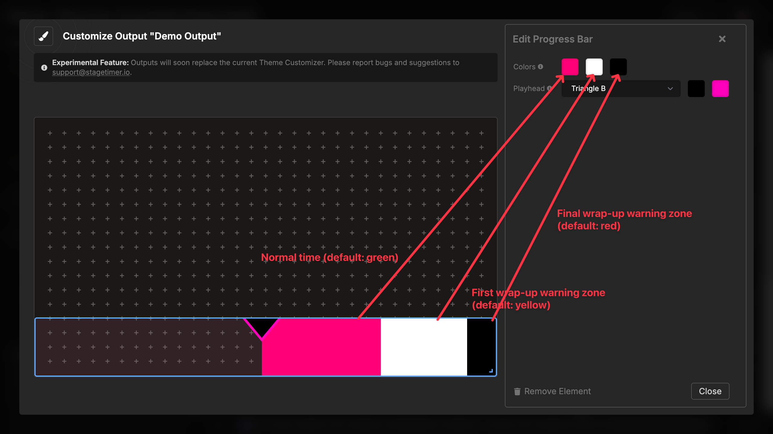
The progress bar displays three color zones that correspond to your timer’s wrap-up warnings:
Three color zones:
- Normal time (green) - The main timing period
- Yellow warning - First wrap-up warning zone
- Red warning - Final wrap-up warning zone
Default colors:
- Normal: Green (#22C55D)
- Yellow warning: Amber (#F59E0C)
- Red warning: Red (#EF4444)
You can customize all three colors to match your branding or visual requirements. The colors appear in both the faint background (showing the full layout of zones) and the filled foreground (showing current progress).
Color selection:
- Click any of the three color dots
- Choose a custom color using the color picker
- Colors update immediately in the preview
- All three colors are independent
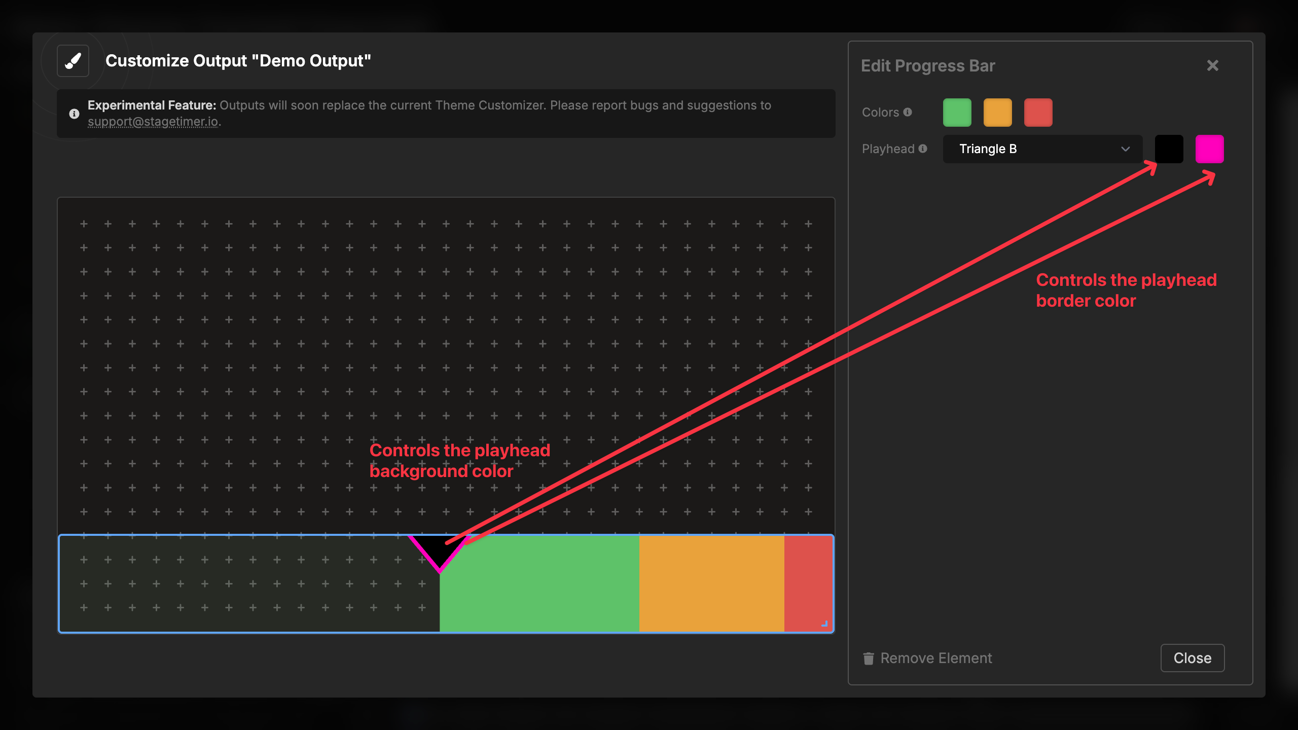
Playhead Options
The playhead is a visual indicator that marks the exact current position in the progress bar:
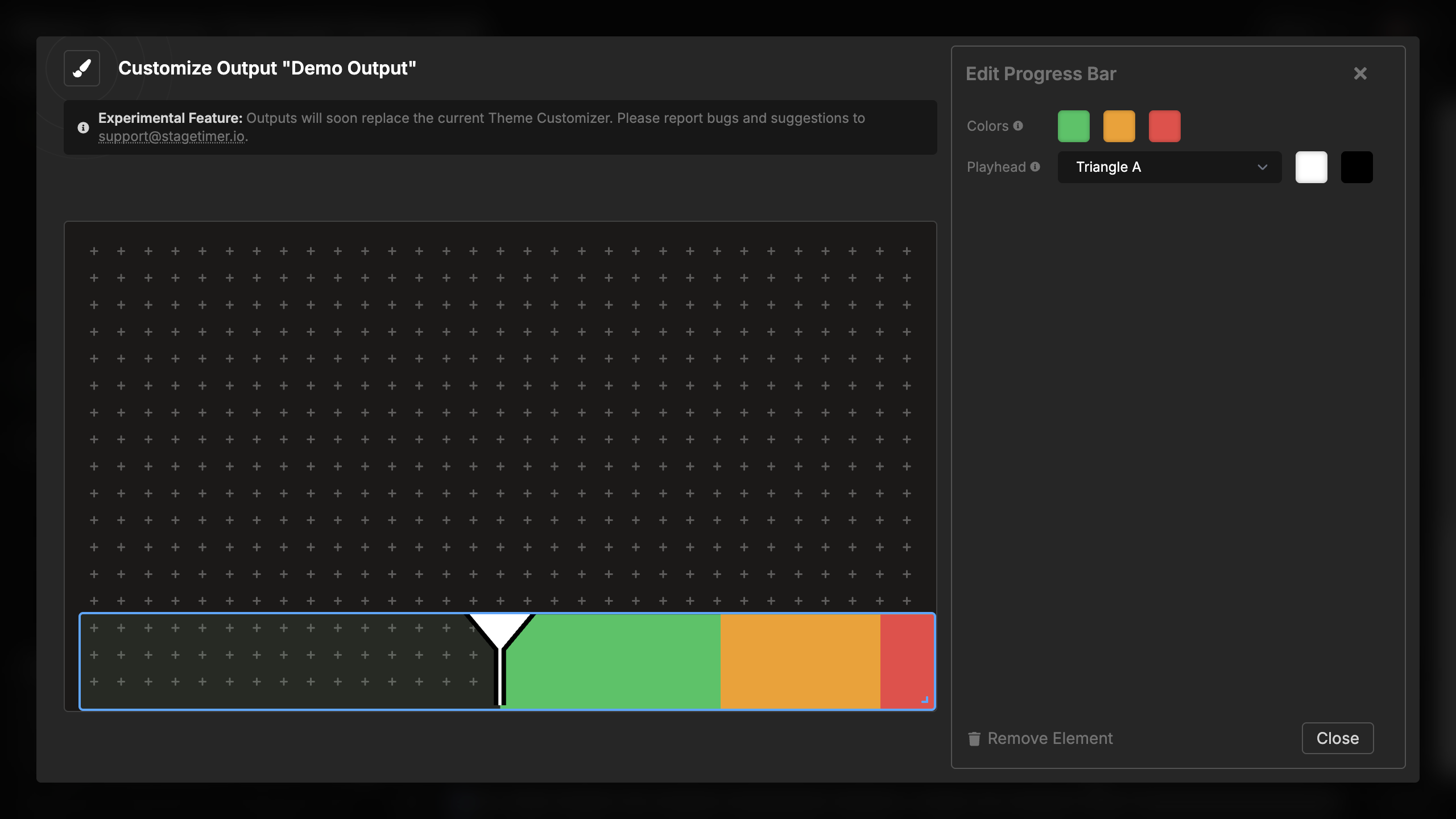
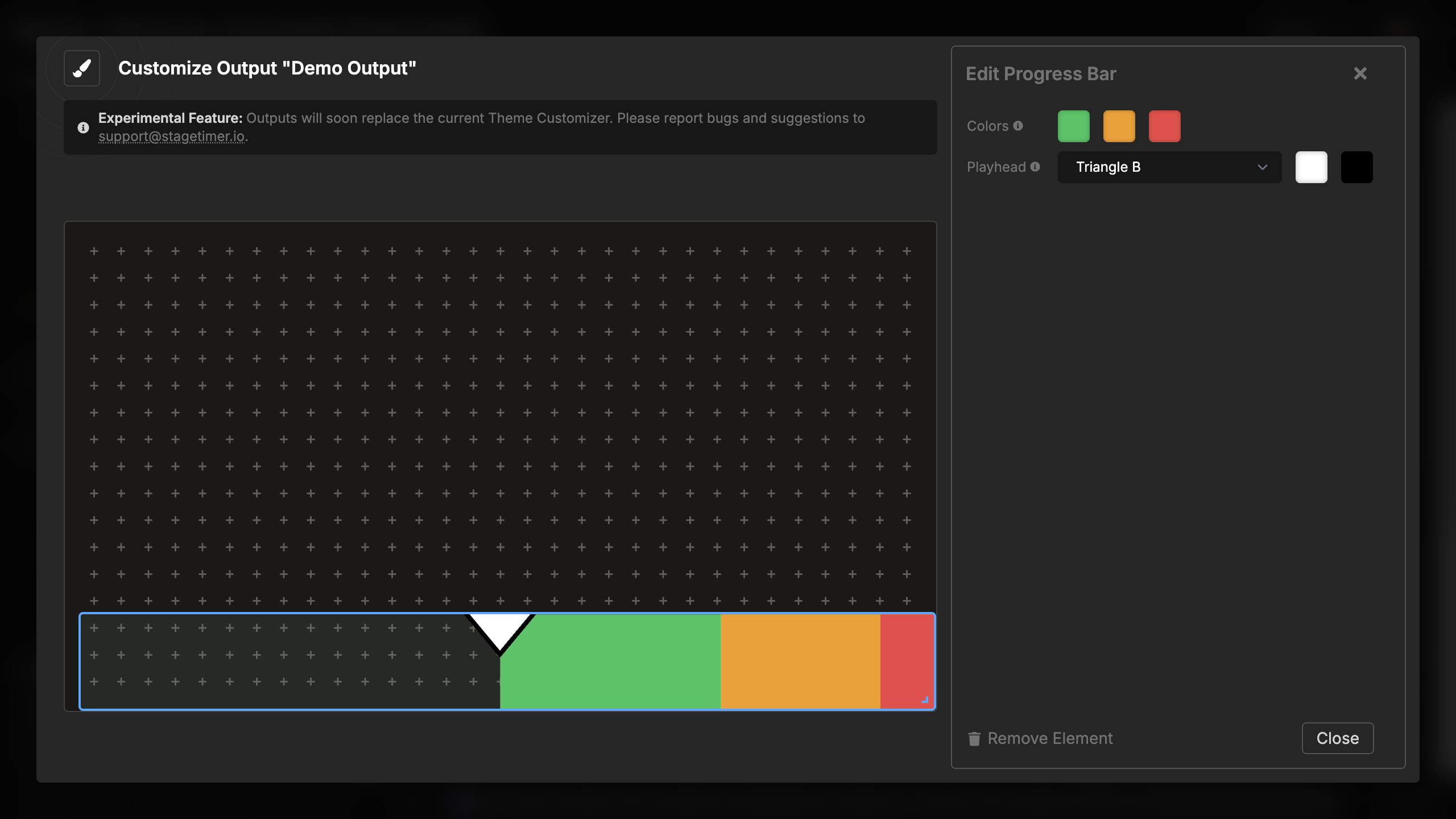
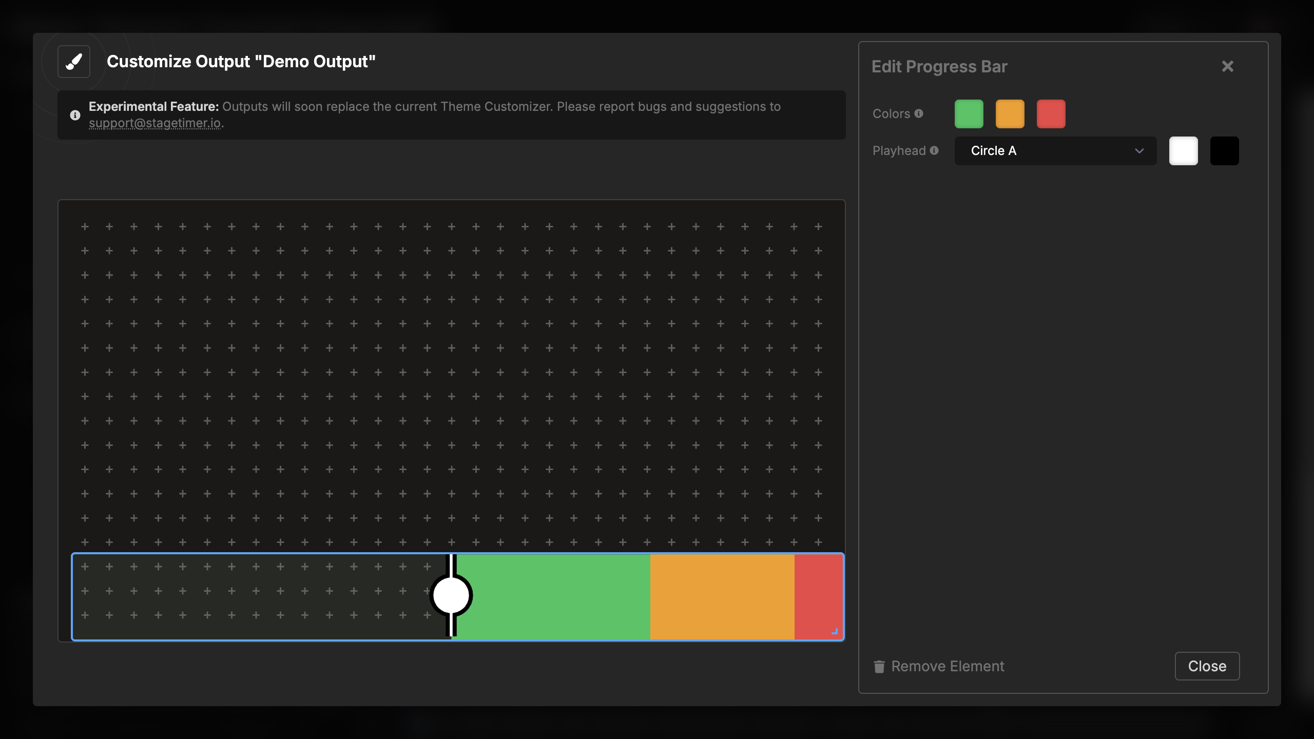
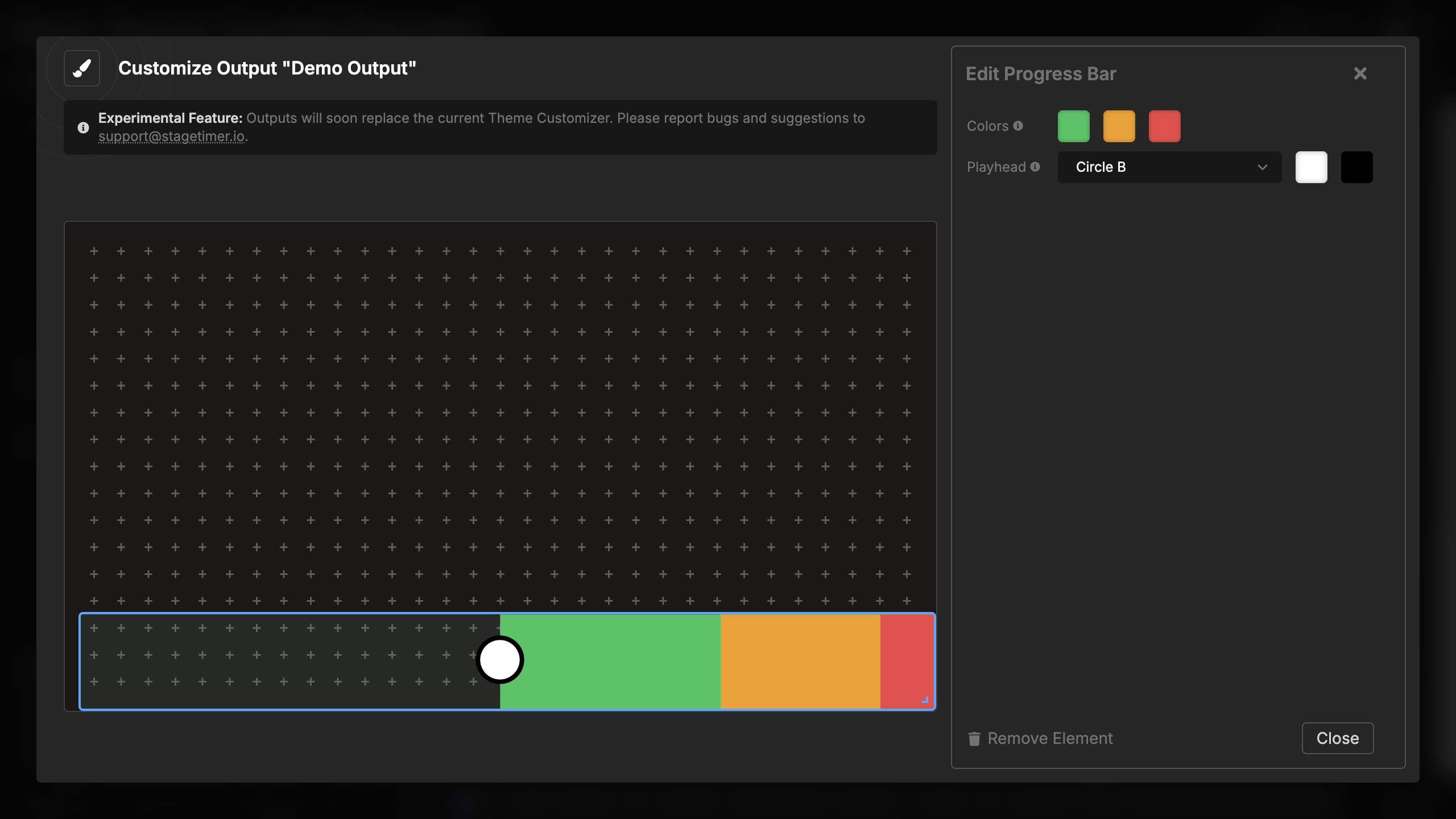

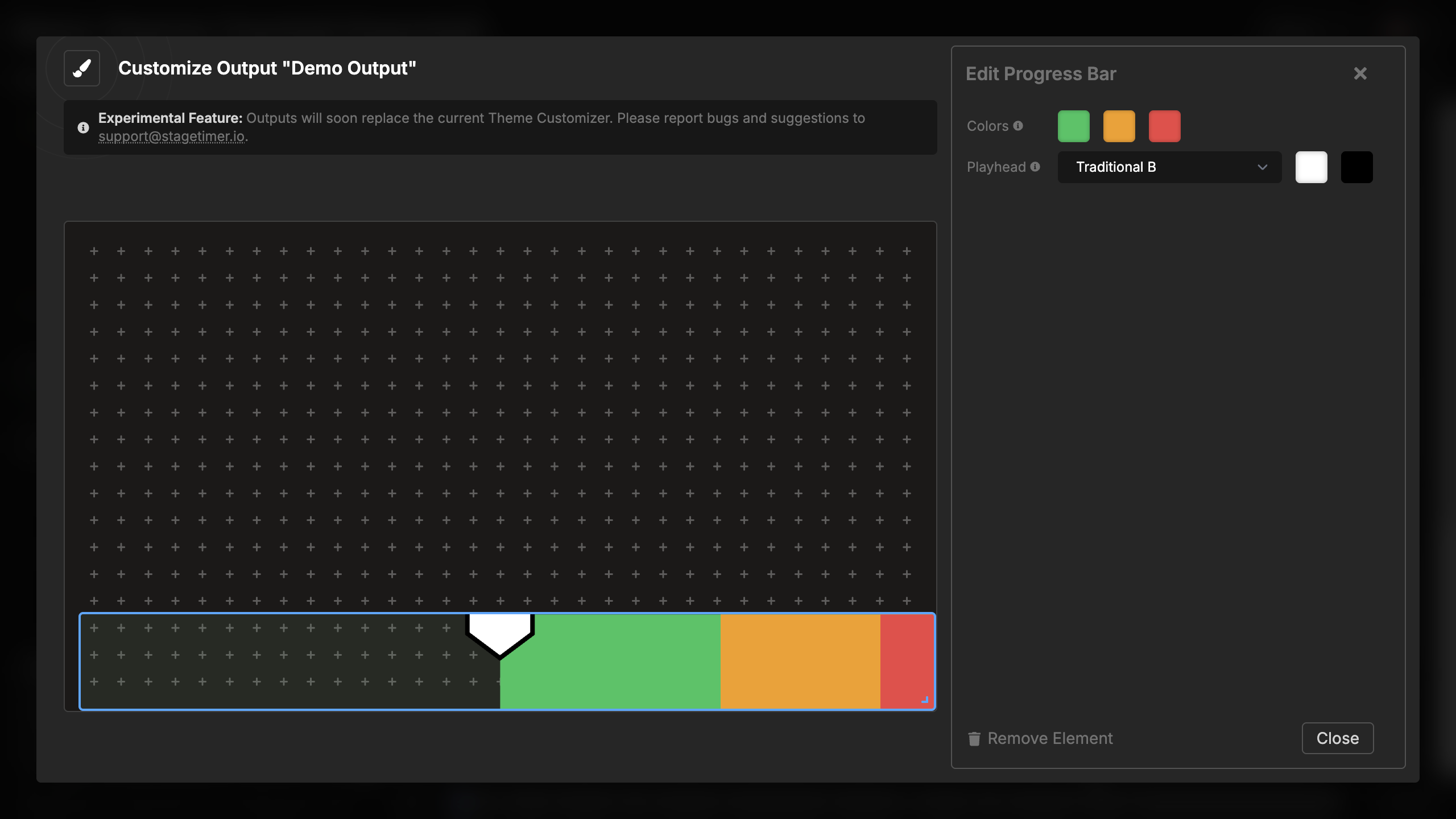

Available playhead shapes:
- Triangle A - Large triangle extending down
- Triangle B - Compact triangle at top
- Circle A - Circle with vertical line
- Circle B - Circle only
- Traditional A - Classic DAW-style playhead with line
- Traditional B - Simplified traditional style
- None - No playhead indicator
Playhead colors: Configure two colors for the playhead:
- Fill color - Main color of the playhead shape (default: white)
- Stroke color - Outline color of the playhead (default: black)
The stroke provides contrast and ensures the playhead remains visible against any background. You can match these colors to your theme or use high-contrast combinations for maximum visibility.
Visual Behavior
Progressive fill:
- Bar starts empty at the left edge
- Fills gradually from left to right as time elapses
- Progress is proportional to time elapsed vs. total time
- Smooth animation with no jumps or stuttering
Color zones:
- Background shows all three zones at 5% opacity
- This provides a visual map of where warnings will occur
- Foreground fills with full-color zones as time progresses
- Color changes occur precisely at your configured warning times
Playhead movement:
- Moves smoothly from left to right
- Positioned at the exact dividing line between elapsed and remaining time
- Height adapts to the progress bar height (maximum 80px)
- Remains visible at all positions
At zero:
- Bar fills completely to the right edge
- Shows full red color if in red warning zone
- Playhead reaches the right edge
- If timer continues past zero, bar remains full