Progress Ring Element
What is the Progress Ring Element?
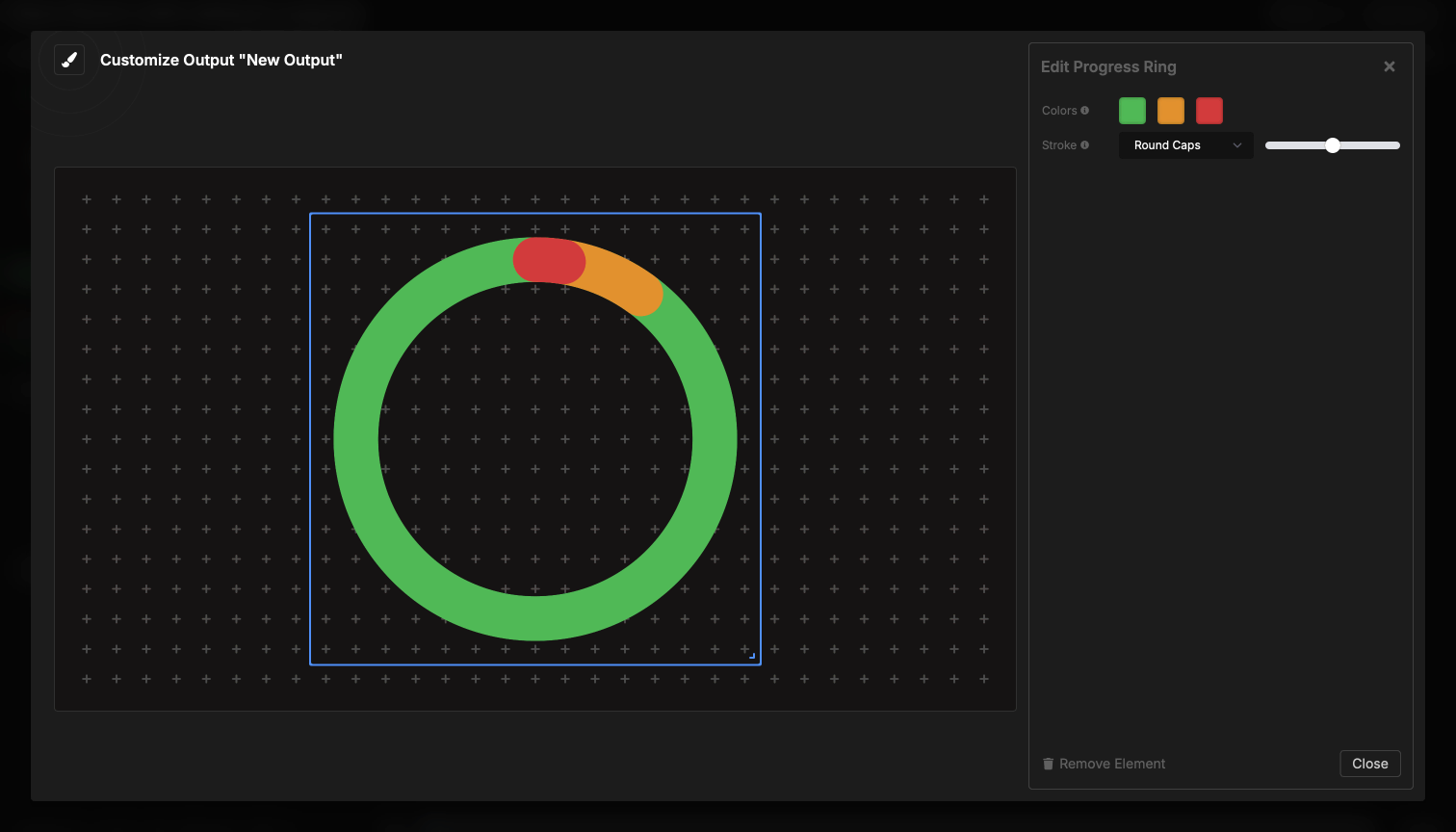
The Progress Ring element displays timer progress as a circular ring that fills clockwise as time elapses. Like the Progress Bar, it shows your timer’s wrap-up warning zones in different colors, but in a compact circular format that works well in corners or as a surrounding element.
The circular design makes efficient use of square spaces and provides an elegant, modern progress indicator that doesn’t require reading numbers.
How It Works
The progress ring automatically tracks the currently active timer:
- When a timer starts, the ring begins filling clockwise from the top
- Colors change based on wrap-up warning zones (green, yellow, red)
- Ring fills progressively around the circle
- Completes the circle when the timer reaches zero
The ring updates smoothly in real-time, providing constant visual feedback about time remaining. It automatically follows your active timer without any manual control.
Visual layout:
- Ring fills clockwise starting from 12 o’clock position
- Background shows all three color zones at low opacity
- Foreground shows progress with full color saturation
- Center remains empty (perfect for placing other elements inside)
Element Settings
Color Configuration
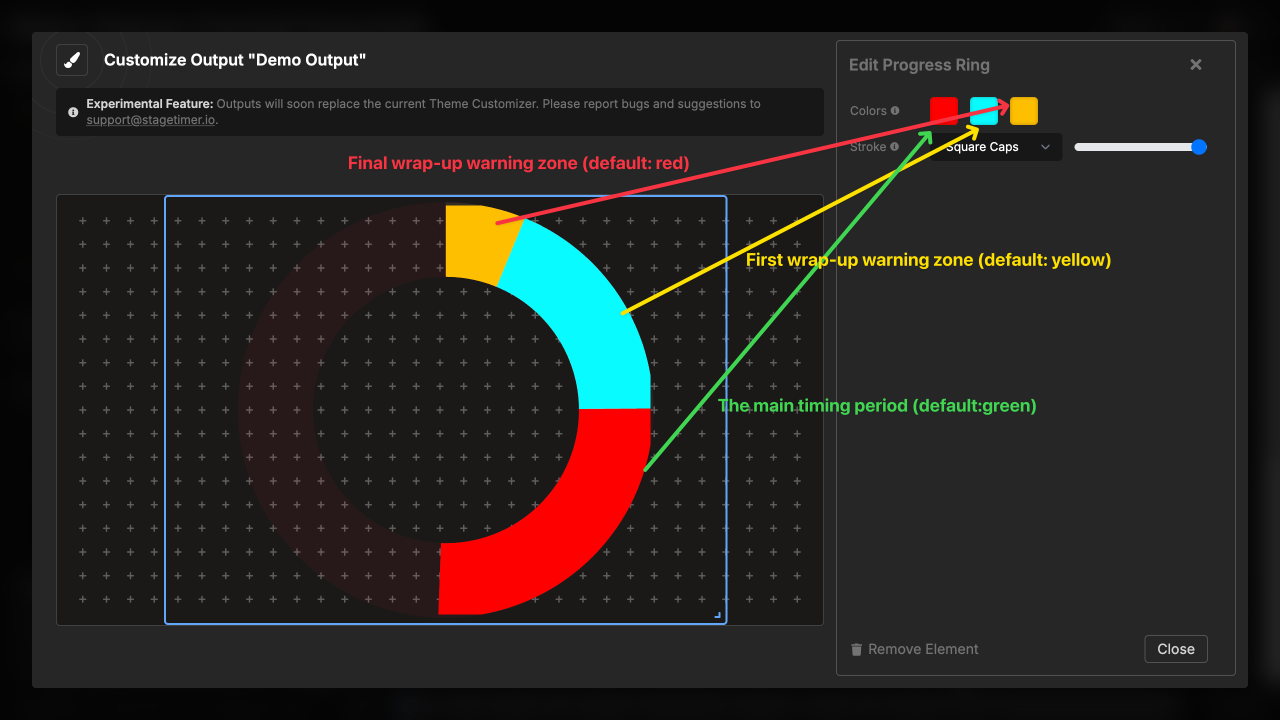
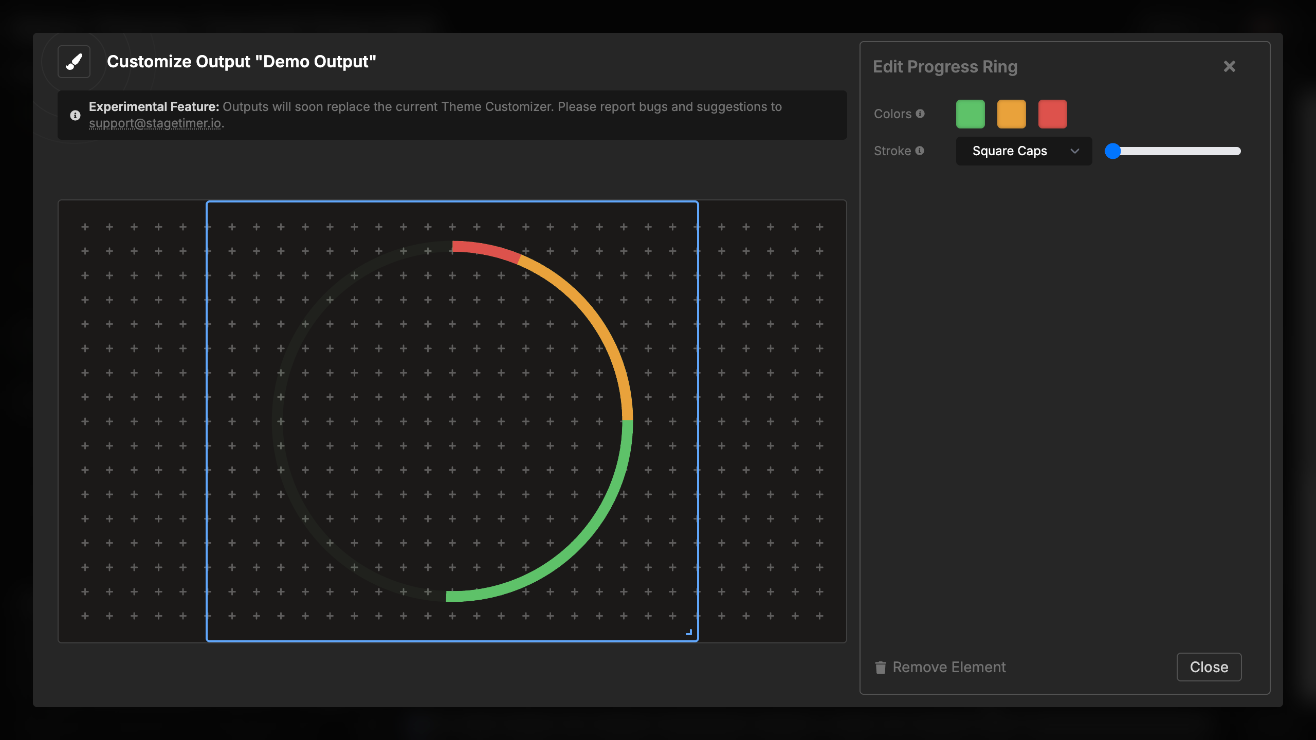
The progress ring displays three color zones that correspond to your timer’s wrap-up warnings:
Three color zones:
- Normal time (green) - The main timing period
- Yellow warning - First wrap-up warning zone
- Red warning - Final wrap-up warning zone
Default colors:
- Normal: Green (#22C55D)
- Yellow warning: Amber (#F59E0C)
- Red warning: Red (#EF4444)
You can customize all three colors to match your branding or visual requirements. The colors appear in both the faint background (showing the full layout of zones) and the filled foreground (showing current progress).
Color selection:
- Click any of the three color dots
- Choose a custom color using the color picker
- Colors update immediately in the preview
- All three colors are independent
Stroke Settings
Configure the appearance of the ring’s stroke (the line that forms the circle):
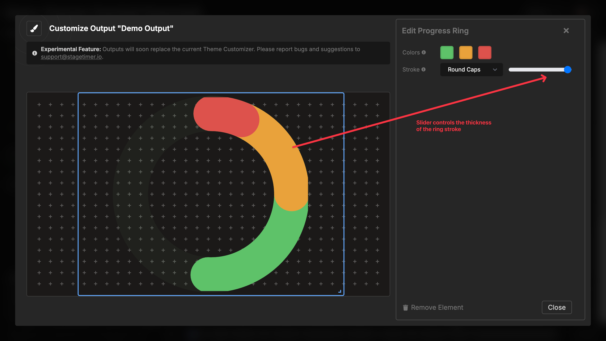
Stroke thickness:
- Adjustable slider from thin to thick
- Range: 1 to 7 units
- Thicker strokes are more visible at a distance
- Thinner strokes are more subtle and elegant
- Default: 4 units (balanced visibility)
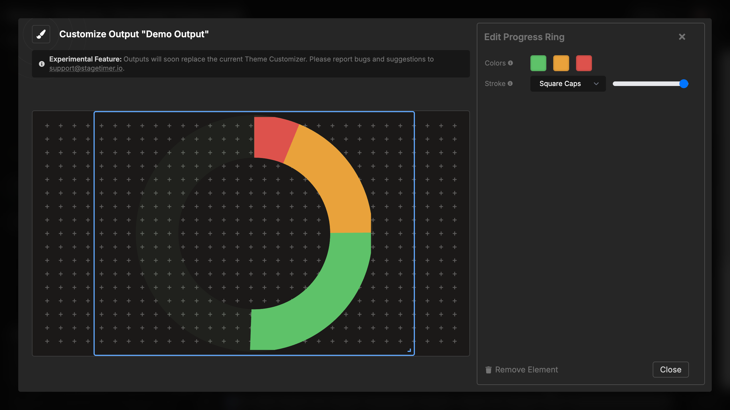
Line cap style:
- Round Caps (default) - Smooth, rounded ends at the progress point
- Square Caps - Flat, square ends at the progress point
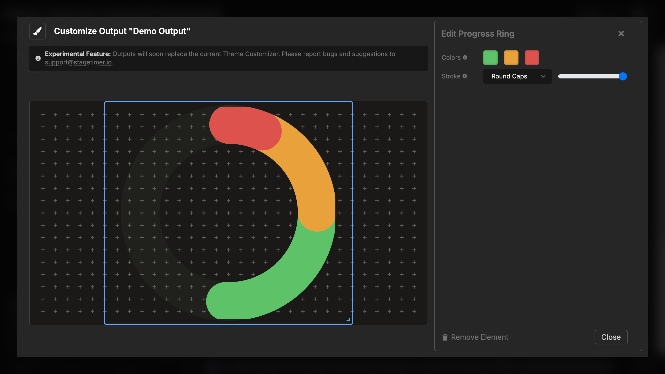
Round caps:
- Creates a softer, more organic look
- Ends taper smoothly
- Popular modern design choice
- Works well with most aesthetics
Square caps:
- Creates precise, technical appearance
- Ends cut cleanly at exact angle
- Traditional progress indicator style
- Good for formal or technical contexts
The combination of stroke width and cap style gives you significant control over the ring’s visual character, from delicate and subtle to bold and prominent.
Visual Behavior
Progressive fill:
- Ring starts empty (no fill)
- Fills clockwise from the top (12 o’clock position)
- Progress is proportional to time elapsed vs. total time
- Smooth animation with no jumps
Color zones:
- Background shows all three zones at 5% opacity
- This provides a visual map of where warnings will occur
- Foreground fills with full-color zones as time progresses
- Color changes occur precisely at your configured warning times
Rotation:
- Always starts at top center (12 o’clock)
- Progresses clockwise (like a clock’s hands)
- Completes full circle at 100% progress
- Intuitive direction matching clock movement
At zero:
- Ring completes the full circle
- Shows full red color if in red warning zone
- No gap at the completion point
- If timer continues past zero, ring remains full