Text Element
What is the Text Element?
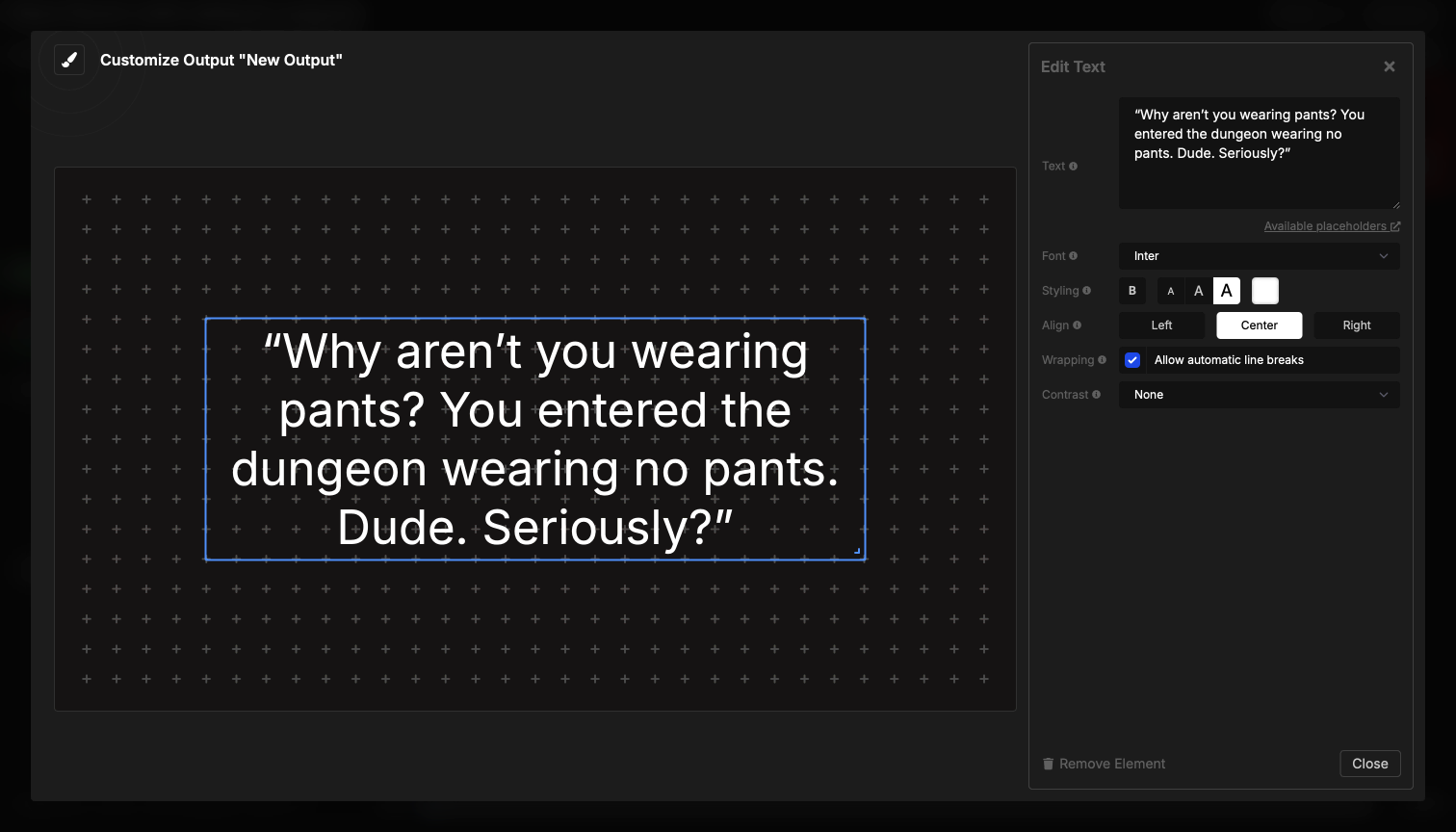
The Text element displays custom text content in your output. You can use it for static labels, titles, instructions, or dynamic content using placeholders that automatically update with information from your rundown.
The text element automatically scales to fill the available space, making the text as large as possible while fitting within the element’s boundaries. This ensures your text is always readable regardless of the output size or aspect ratio.
How It Works
The text element is straightforward:
- Enter your text in the settings
- Configure styling (font, size, color, alignment)
- The text appears in your output
- Text automatically scales to fill the available space
The text remains static unless you use placeholders, which automatically update when timer information changes. You can create multiple text elements in a single output for different labels or sections.
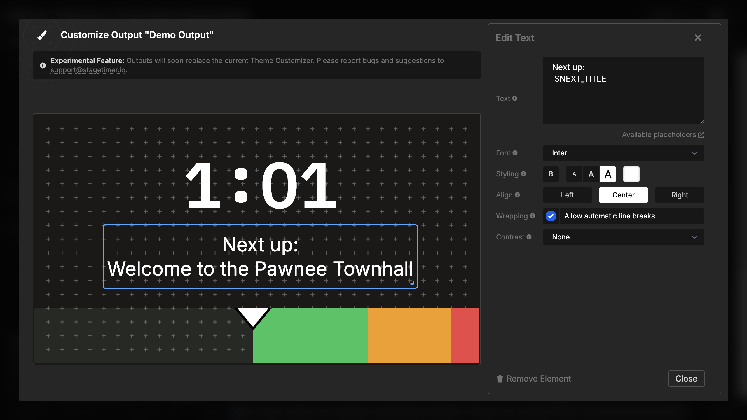
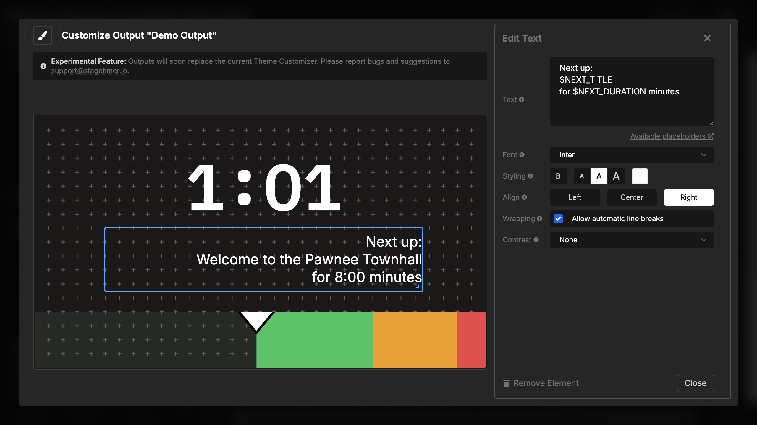
Using Placeholders
Text elements support dynamic placeholders that automatically update with information from your rundown. This allows you to create text that changes as you progress through your timers.
Available Placeholders
Room Information:
$ROOM_TITLE- The name of your room
Current Timer (highlighted):
$CURRENT_TITLE- The title/name of the current timer$CURRENT_SPEAKER- The speaker field of the current timer$CURRENT_NOTES- The notes field of the current timer$CURRENT_LABELS- All labels assigned to the current timer (comma-separated)$CURRENT_START- The start time of day for the current timer$CURRENT_FINISH- The finish time of day for the current timer$CURRENT_DURATION- The duration of the current timer (formatted as MM:SS)
Next Timer:
$NEXT_TITLE- The title/name of the next timer$NEXT_SPEAKER- The speaker field of the next timer$NEXT_NOTES- The notes field of the next timer$NEXT_LABELS- All labels assigned to the next timer (comma-separated)$NEXT_START- The start time of day for the next timer$NEXT_FINISH- The finish time of day for the next timer$NEXT_DURATION- The duration of the next timer (formatted as MM:SS)
Example usage:
Next up: $NEXT_SPEAKER
$NEXT_TITLE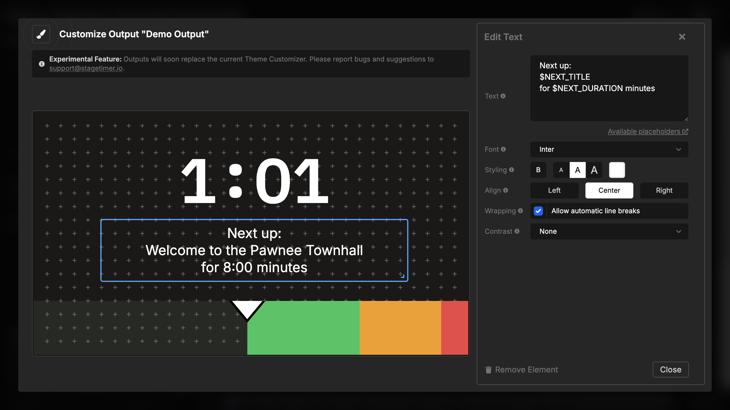
When you advance to the next timer, the placeholder text automatically updates to show the new information. Times and durations are formatted according to your room settings (12h/24h format and timezone).
Element Settings
Text Input
Enter the text to display in the multi-line text area. You can:
- Enter multiple lines of text
- Use placeholders for dynamic content
- Keep text short for large display or longer for detailed information
- Leave blank to show an empty placeholder in preview mode
The text area accepts plain text only. For formatted text with bold, colors, or uppercase, use the Message element instead.
Font Selection
Choose the font family for your text:
- Built-in fonts: IBM Plex Mono (default), Inter, Open Sans, Poppins, and many more
- Custom fonts: Upload your own fonts for brand-specific displays
- Fonts automatically load when the output is opened
Different fonts have different character widths and styles, which affects how much text fits in the available space.
Styling Options
Customize the visual appearance of your text:
Font weight:
- Light, Regular (default), Medium, Semibold, Bold
- Heavier weights are more readable at a distance
Font size:
- Small (76%) - Leaves more breathing room
- Medium (88%) - Balanced size (default)
- Large (100%) - Fills the maximum available space
Color:
- Any hex color value
- Default is white (#fff)
- Choose colors that contrast with your background
The font size setting determines what percentage of the available space the text fills. Large (100%) makes text as big as possible, while smaller sizes create space around the text.
Text Alignment
Set the horizontal alignment of text within the element:
- Left - Text aligns to the left side
- Center - Text centers horizontally (default)
- Right - Text aligns to the right side
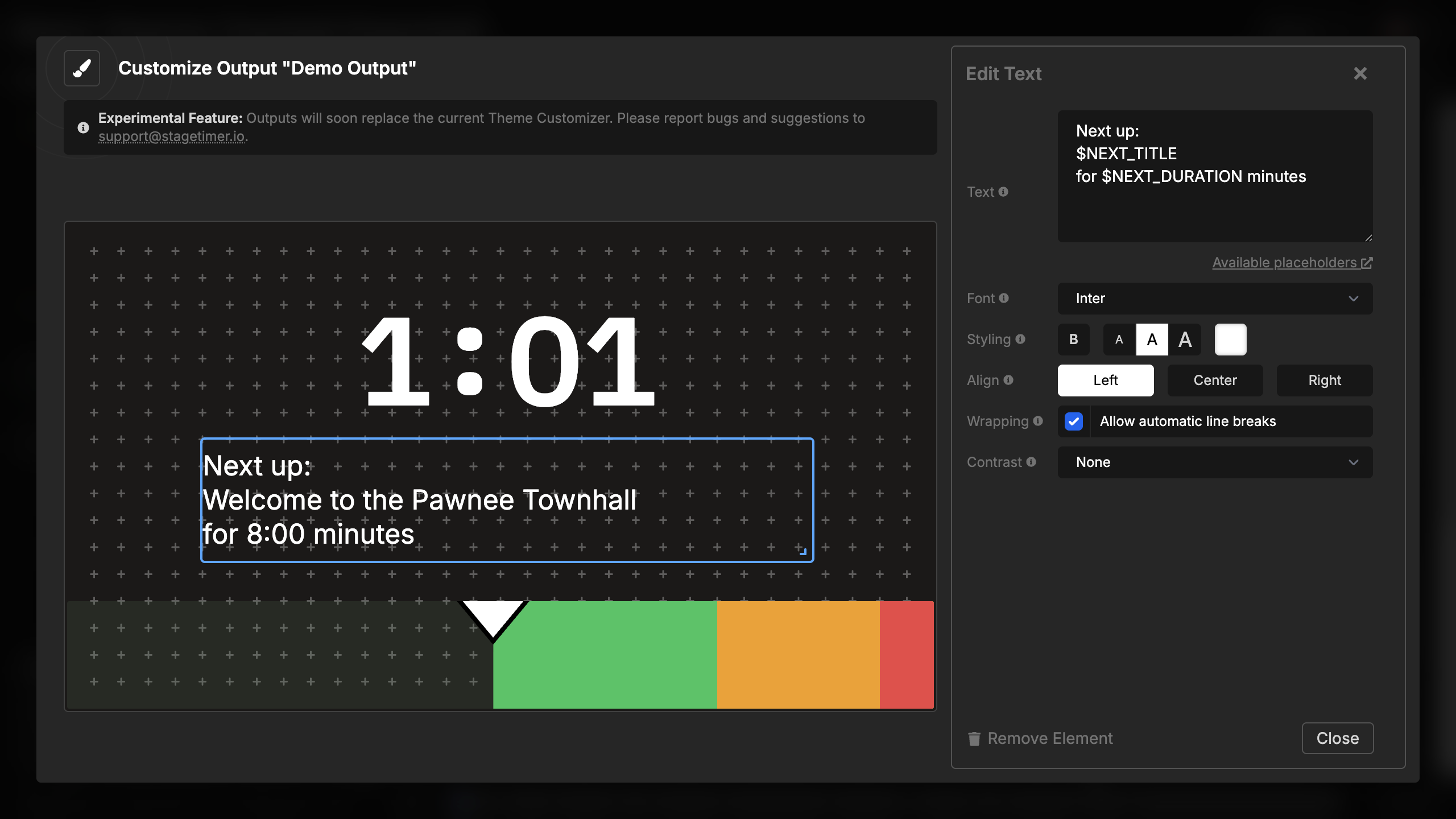

Multi-line text and wrapped text will align according to this setting.
Text Wrapping
Control how text wraps within the container:
- Enabled (default) - Text wraps to multiple lines when needed
- Disabled - Text scales down to fit on a single line without breaking
When wrapping is disabled, long text will scale down to remain on one line. This is useful for single-line labels where line breaks would look awkward. When enabled, text breaks into multiple lines and scales to fill the available height.
Text Contrast
Add visual effects to improve text readability against backgrounds:
- None - No additional effects
- Shadow - Drop shadow behind the text
- Outline - Stroke outline around characters
- Background - Semi-transparent background behind text
These effects are particularly useful when displaying text over video backgrounds, imagery, or gradients where plain text might be difficult to read.